


Project Reveal: Hip Acadian
I was contacted by a couple in Midland, TX who found Duckworth Interiors on social media and asked us to design their custom French Acadian home. I have to say how flattered I was that they knew they wanted to work with us because of previous Acadian homes we’d worked on! This young and fun family wanted to take a fresh approach to the French Acadian style and thus, “Hip Acadian” was coined.
The exterior of the home is a more traditional pallet of Texas limestone, antique brick, and cedar.
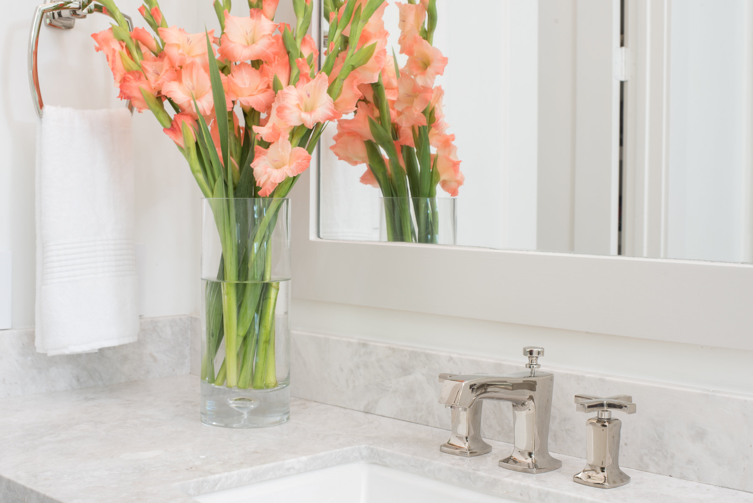
When you walk in the front door, you’re in the main living space with the dining room in the middle and the kitchen and family room on either side. You’ll notice we brought the antique brick inside with a chunky brick-clad arch way separating the kitchen from the rest of the space.
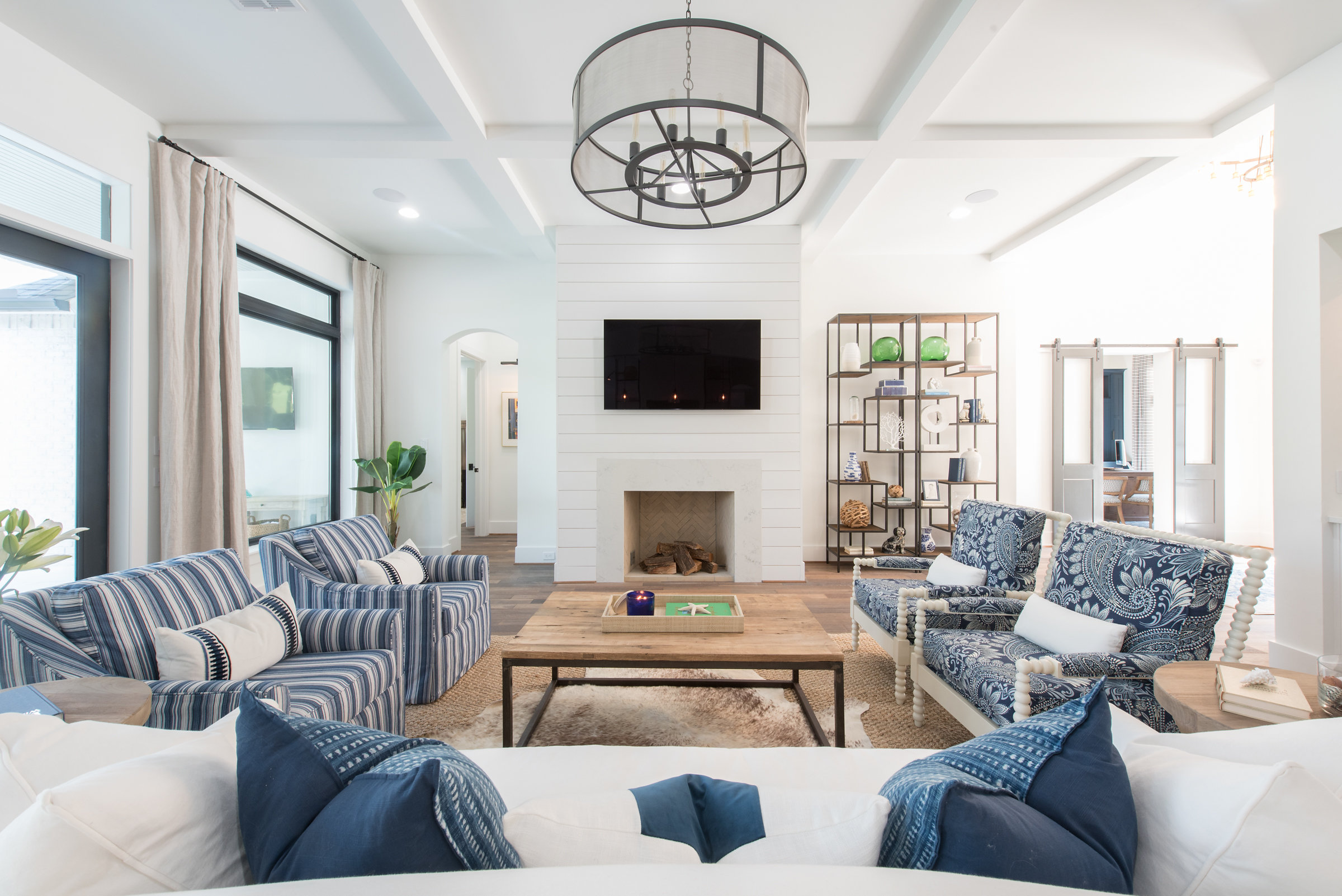
The antique brick was also used for the fireplace hearth seat. We decided to use cedar accents inside for the family room beams, fireplace mantle, and on the kitchen hood.

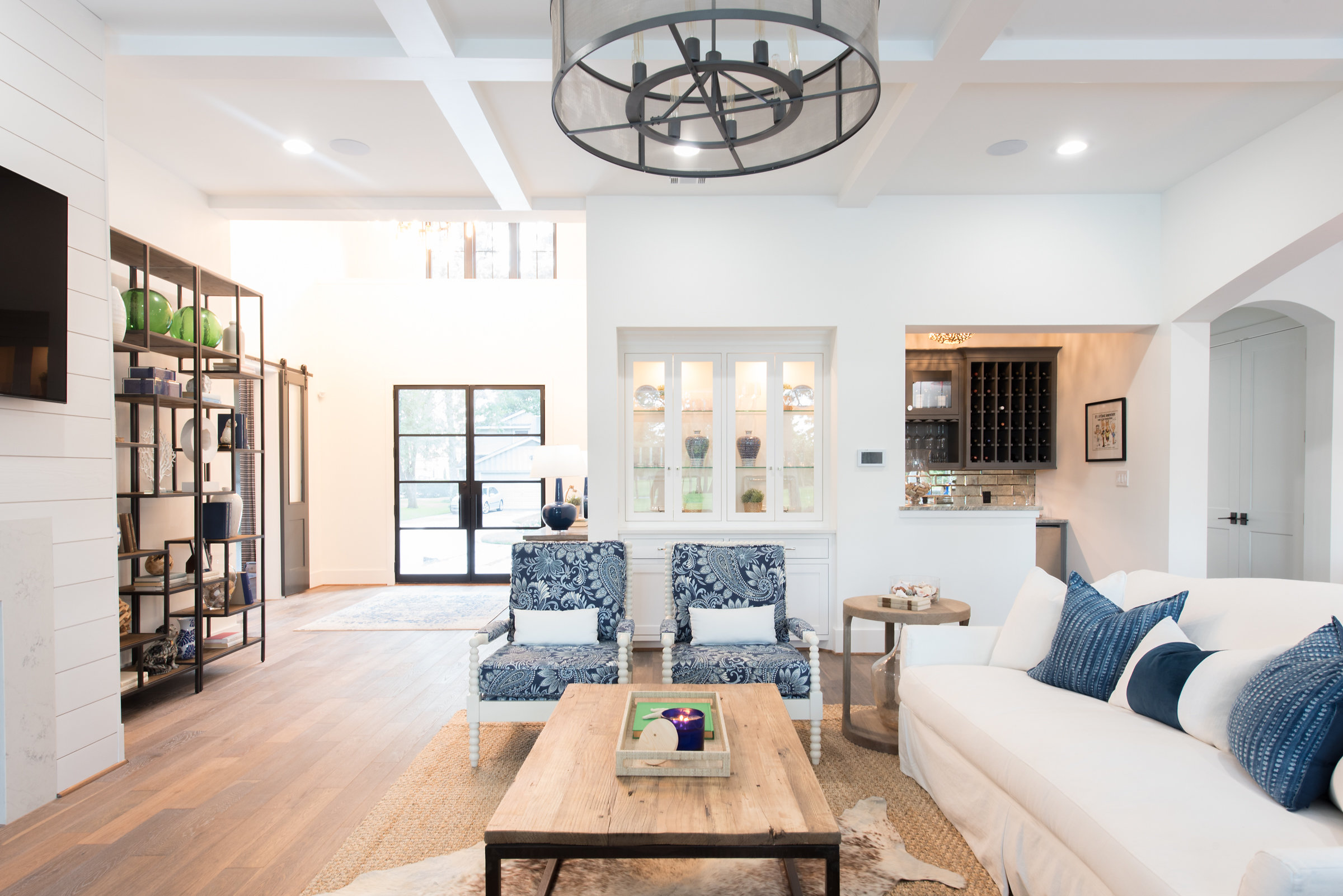
We filled the two 11 foot tall built-ins that flank the fireplace with blue books, family photos, accessories, and some greenery.

For the furnishings in the main living area, we used an overall neutral palette with varying hues of blue. For the brick arch way going into the kitchen, it was important to me that this appear to be an old exposed structural wall. To achieve that, it meant we needed to take the brick to the ceiling on both sides.

We chose to drop the kitchen ceiling to make it feel more cozy. We painted the perimeter cabinets white, slightly darker than the walls for just the tiny contrast. The perimeter countertops are black with a subtle white vein. The island we painted navy and used a quartzite countertop with lots beautiful linear movement.


Leather always pairs nicely with navy, so these barstools were a beautiful and durable choice.

We chose Cafe Appliances in the kitchen, which is a line that allows you to mix and match the appliance color and handle finish. I love using Cafe for this reason. Also, how adorable is this French door oven?!
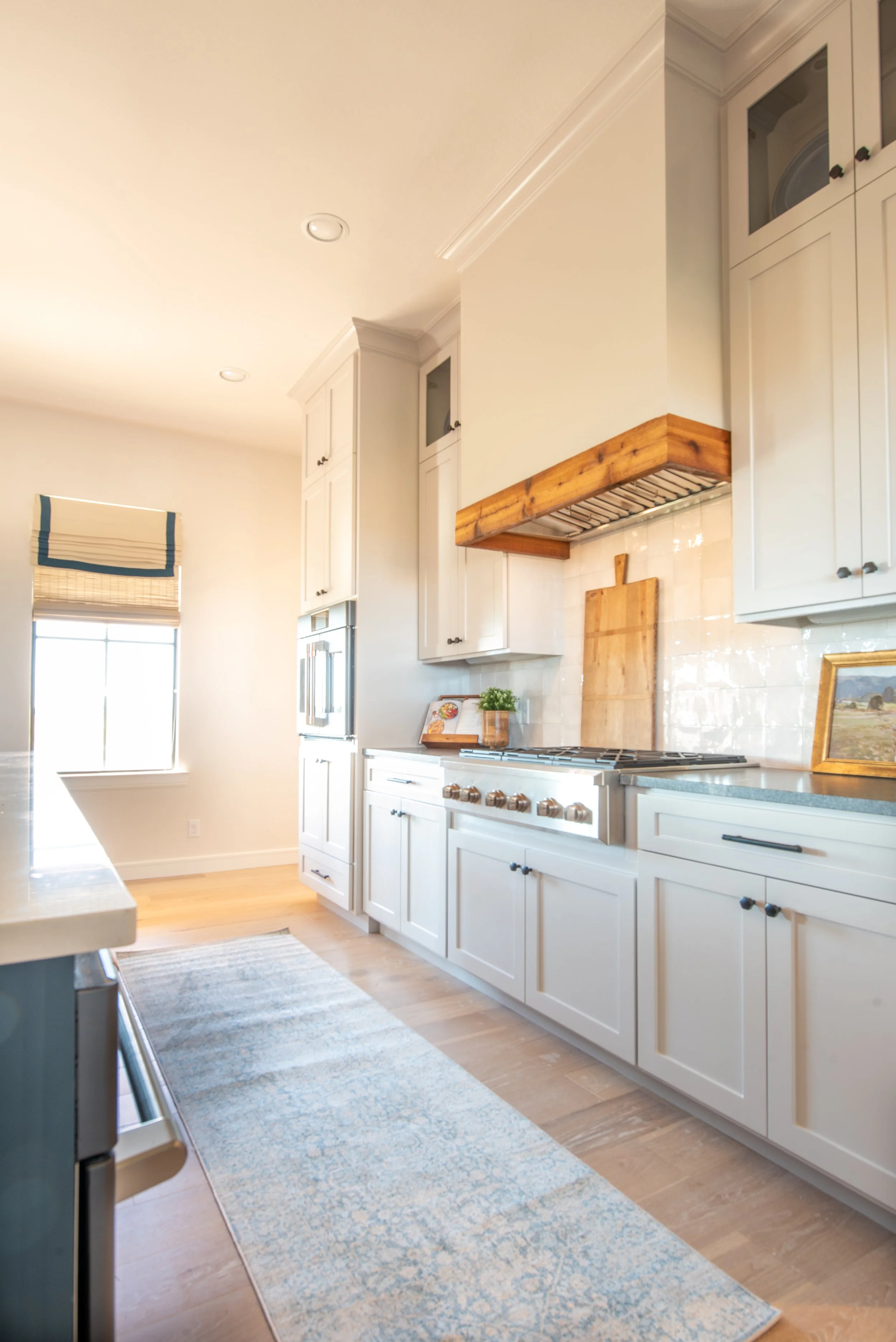
A simple zellige tile with variations of cream and grey was used for the backsplash.

For the laundry room, we used the same paint color and countertop that we used on the kitchen perimeter. We laid the antique brick on the floor in a herringbone pattern.

My clients and I were antiquing one day, and we happened upon this “army green” military-style desk. We were all in love! We used 1x2 wood trim to created some interest and texture on the feature wall. To find our paint color for the feature wall, we ended up taking a desk drawer to be color matched at the paint store!

The credenza was a family piece that we reused. Above it are some prints I found while shopping for my clients in New York. The drapery is a mid-century pattern in earth tone colors.

We had some fun in this secondary bath using black and white hex tiles, a blue-grey cabinet and chrome fixtures and accessories.

Secondary bathtubs have come a long way over the years. These days, it’s easy to find tubs deep enough that an adult would actually enjoy bathing in!

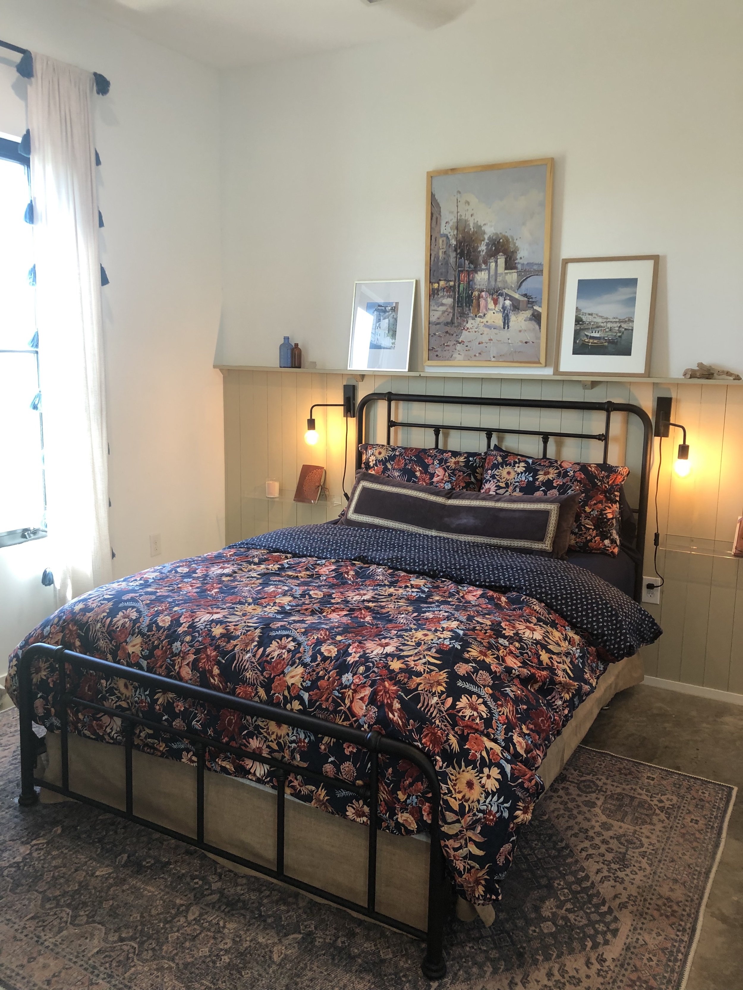
In the guest bedroom we used a neutral palette with dark green nightstands, accent pillow, and antique suitcase.

Reading lights next to the bed with switches are great in guests bedrooms. They allow your guests to turn off the overhead lights and navigate their way to the bed easily in an unfamiliar room.

Some black and white prints of Texas landscapes by my husband and photographer, Grant Duckworth, give guests a taste of some local scenery. When I take prints to be framed, sometimes I like to “weight” the mat at the bottom, as seen here. This is a great solution when you need art to fill a space that’s larger than the print you have.

The game room is a fun and electric space! You can only be happy in this room! The lady of the house is a huge Beatles fan and requested a Beatles-themed room.

The design evolved around the two Beatles prints that we found for above the sectional. We pulled all of the colors out of the prints for everything else.

The homeowners also requested an antique record player cabinet. We found this one in a Dallas antique store that had been fully restored, including adding Bluetooth capabilities for our modern world. It was painted a fun lacquered turquoise! Above the cabinet is a Kate Roebuck print flanked by orange lamps.
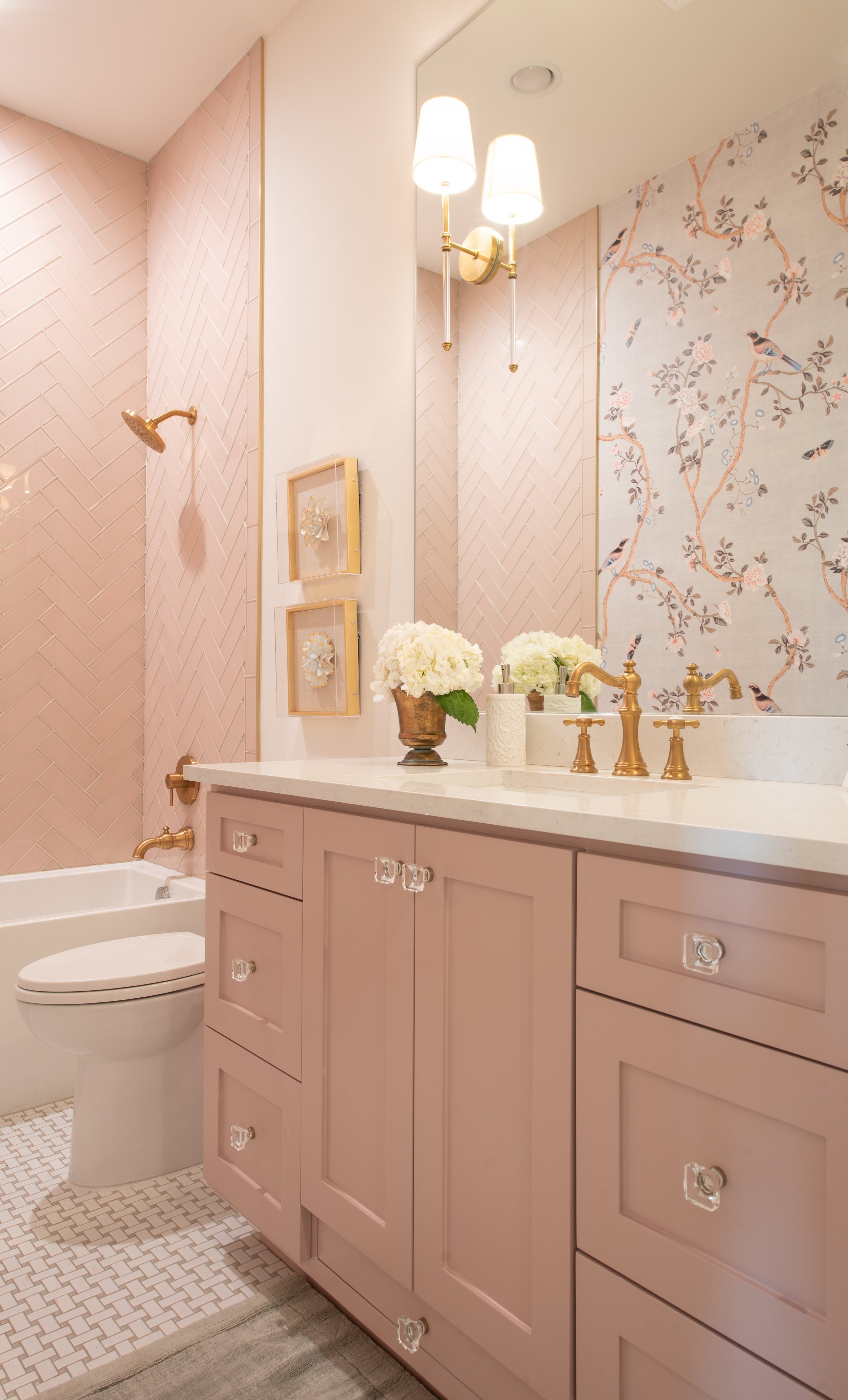
Up next: a bath for a princess! We were so delighted to design this adorable bathroom for our clients’ newborn baby girl. We used pink glass subway tile. Again, we used our color match trick to match the cabinet paint color to the tile. Gold fixtures and crystal knobs are the icing on the cake!

Check out her hidden stool! We love to design with functionality in mind. This platform was built into the cabinetry. Simply slide it out when needed and back in when finished.
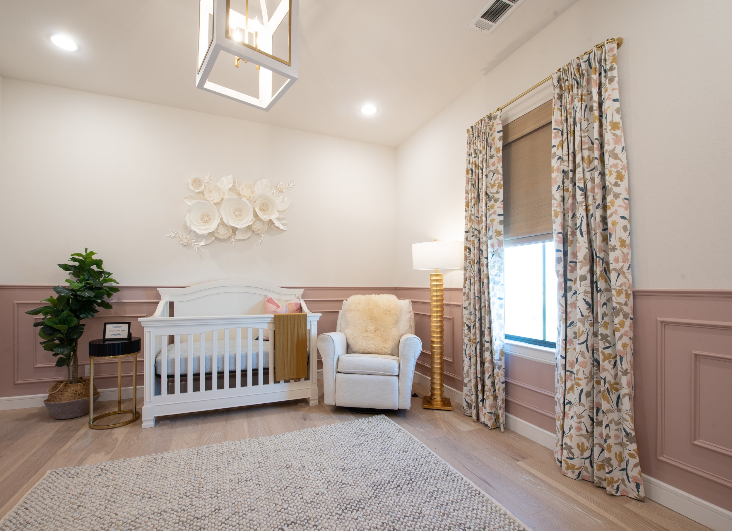
We continued the pink into her nursery with a paneled wainscoting. I’m always very careful about what I put on the walls above cribs. I’d never want anything to fall on a sleeping baby! That’s why these 3 dimensional paper flowers were a beautiful and safe art solution. A comfortable glider/recliner with dimmable lighting for nighttime feedings is a must (and so are blackout drapes)!

We added a fun and whimsical art piece above the changing table that will transition from art for a nursery to a child’s bedroom.

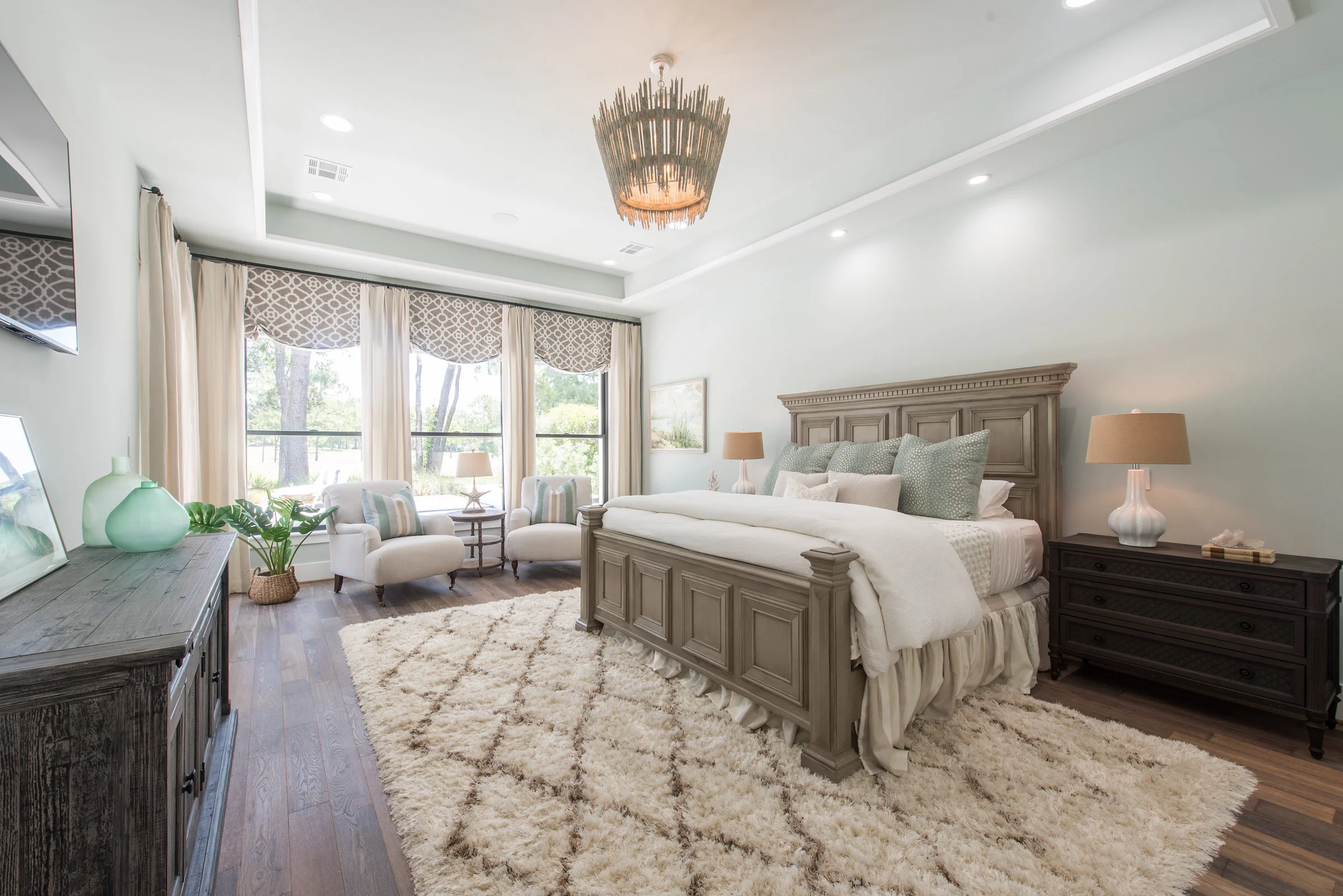
We had a lot of fun with color in the master bedroom! Again this room was designed around the art. The pieces above the bed are by a Spanish artist, Natalia Roman. We used a navy velvet bed, a mustard yellow settee, and a black marble table.

The drapes are a fun pattern and by artist Angela Chrusciaki Blehm.

A sliding door separates the master bedroom from the master bath room.

The showpieces of this bathroom is the grey clawfoot tub with crystal chandelier above. We matched the color of the cabinets to the tub and clad the whole bathroom in marble!

I hope you enjoyed this project reveal of the #hipacadian project! Be sure to click here to see our feature in the Ellis County Living Magazine. Drop a comment and let us know what you think!

Toys, Toys Everywhere!
"How in the world did we accumulate so much stuff?!?” Surely, I’m not the only one that feels this way. Along with kids (I have three of them) comes lots of collections. Little ones are more likely to stay organized if they have systems in place. Most of my clients have children, too, so organization is something that’s a must in all of my designs. I’m going to share some tips with you to help tackle the clutter.
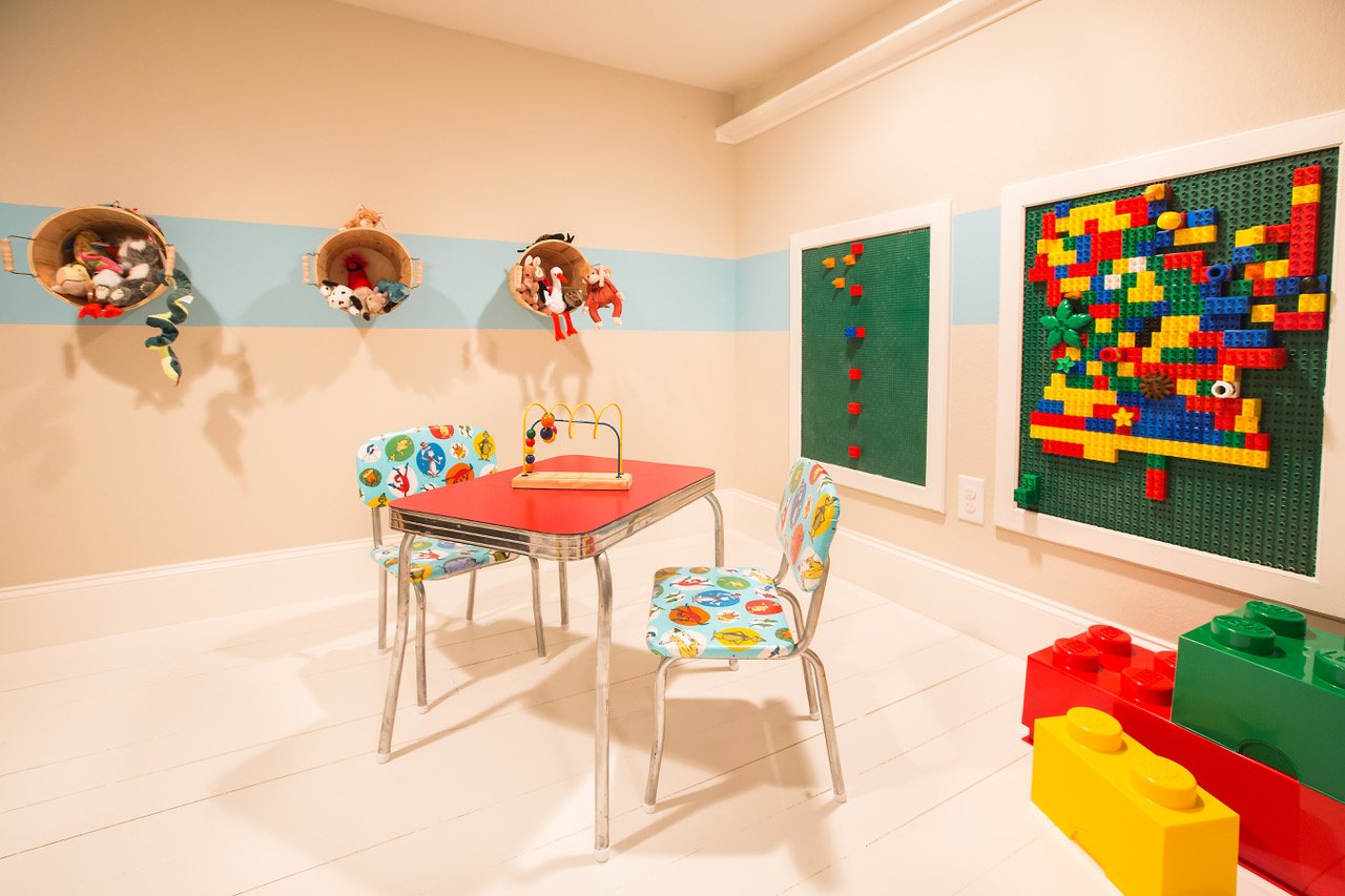
I love to group items together and organize them as an artistic collection. In this colorful playroom, I made an entire wall of books. We hung shallow shelving along a feature wall, allowing for their books to be proudly displayed. This gives a place for everything, allows the reader to see all of the books they have to choose from, and makes for a pretty cute, ever-evolving art installation. It’s a simple addition that could be added to most any room.

Another item I use in most of my organizational projects is baskets. Baskets are so versatile and can be used to store objects of many different sizes and shapes. The baskets under the book wall are mesh, making it easy to see what is inside. I also love to hang baskets up on the wall, allowing for toys to be found easily and for them to double as art. Take a look at the stuffed animals playfully hanging out in bushel baskets.

Most kids have tiny collections with millions of pieces (think Legos or Barbies). It’s a challenge to organize them in a way they can be both easily accessible and orderly. Having specific storage containers for these items is crucial. It’s a bonus if the containers can have multiple uses. We found these large, colorful blocks that are made for Lego organization. They double as decoration and seating. Once all microscopic pieces are inside, the lid hides them all away.
In order for your game room to stay organized, there must be some systems set in place. Sometimes thinking outside of the box (or basket in this case) is the perfect solution. Utilizing vertical space and unexpected storage containers can be the solution for arranging unruly toys.
Check out our article in Ellis County Living Magazine here!
Client Spotlight: Crystal Butler
We love to introduce you to our amazing clients! In this Client Spotlight, we’re featuring Crystal Butler. We helped the Butlers with new construction selections and whole house interiors. They aren’t just clients but have grown to be dear friends.

DI: How did you go about your search for an interior designer?
Crystal: I’m a bit obsessed with Pinterest, and I found Kate there! It was amazing to stumble upon her website, only to realize she was based in Texas (a major plus!). We weren’t really in the market for an interior designer, but once we found Kate’s work, we knew immediately that we needed her help on our project!
DI: What was your deciding factor in hiring Duckworth Interiors?
Crystal: Our first meeting was incredibly organic. My husband and I had a bit of unique situation at the time, and Kate took the time to sit down and listen to our story without judgement. We knew that Kate was very talented on the design front, but after meeting with her and realizing how kind and honest she was, we knew it was a perfect fit for us.

DI: What was the most challenging aspect of building a custom home?
Crystal: We had the pleasure of doing all of this after a worldwide pandemic - so many selections were back ordered or all together not available. Luckily, thanks to Kate’s wonderful design eye, we didn’t have many issues with that at all. I remember going into the showroom and literally breaking out into a sweat, due to the overwhelming amount of selections available. Kate made this process so easy! She had already taken the time to figure out what style we liked and was able to easily steer us in the right direction.

DI: What was the most helpful aspect of working with Duckworth Interiors?
Crystal: Kate and her entire team is incredibly organized and prompt. When I had forgotten a particular selection, Kate and her team were easily able to remind me of what we had chosen and offered reassurance and peace of mind!

Mixing It Up This Christmas

It’s the most wonderful time of the year! Christmas music playing, twinkle lights shining, and Amazon packages arriving! The Holidays bring me a lot of joy, and I love nothing more than to deck the halls. Some of us tend to decorate our homes the same way each year. You think, “This garland goes on the staircase…this wreath goes on the front door.” Why not mix it up this year and use what you have in a completely different way?!?

Let’s start with books. Everyone has books laying around: either an old set of encyclopedias or some books with the dust jackets removed. Pick some that have a red, green, white or burgundy spine, whichever coordinates best with your holiday decor. Use them as a festive base for layering found objects. Or add them to blank spaces on a bookcase. They subtly add a touch of Christmas.

Filling a vessel in an unexpected way is another great way to add cheer. Here, we’ve used jars, vases and bowls. Think outside of the box: any vessel with a cool shape or silhouette can work for this. Fill them with colorful ornaments, holiday greenery or even whimsical garlands, anything that is the right scale for the object. These can be placed on top of a stack of books or positioned on a side table. Try laying some on their side with some of the filler “spilling out.”

Do you have a collection of Christmas objects that you always display in a group? Some people collect Santa Clauses or snow men or Christmas villages. Why not break up your collection, and arrange it in different vignettes? Configure them together in clusters of three with varying heights, colors or textures.

This Christmas, don’t get stuck in a rut with your usual Holiday decorating. Use the things you already have around the house and spice them up in a new, fresh way. Or disassemble your collections and display them in new locations. I hope this helps you think outside of the box and brings new life to your Christmas decor.

We are so honored to be featured in the December edition of the Ellis County Living Magazine! Find the article here.

A Simple Thanksgiving Tablescape

I’ve always been a bit over the top. Some might call me a bit “extra.” So, one fall, when I saw these gorgeous pumpkin florals on Pinterest, I thought, “I’ll give it a go! I love a good tablescape!” Usually, these end as “Pinterest fails,” but this time, it worked out! They were super easy and turned out lovely. I’ve even brought them as hostess gifts for various family gatherings over the years. Since this was such an easy project with very little effort, I thought I’d share it with you, just in time for your Thanksgiving tablescape!

When choosing your pumpkin, the possibilities are truly endless. I love to go with a Cinderella pumpkin. But, there is no right or wrong pumpkin to choose.

First, cut off the top and remove all of the pumpkin guts. This is the best part!

Take a Mason jar about the same height as the pumpkin and fill with water. Then, make a grid out of tape (Scotch or floral).

Gather a variety of greenery and flowers in the color scheme of your choosing. Believe it or not, I was able to forage all of the greenery and small flowers from my mom’s garden! I had the faux fall florals lying around and decided to add them into my arrangements, too.

TA DA!!!

I made place cards with mini pumpkins and foliage. Just print the names on card stock, cut a slit in the pumpkin and add the place cards. I included a small sprig from the foliage I used in the centerpiece.

I made a couple smaller arrangements with the remaining foliage.

Now, the best part is setting up that tablescape! I placed a burlap runner down the middle of the table and a candlestick at each end. I had some wood slices that I used as my “chargers”. I did a simple trim-fold with the napkin and laid the plate on top. Lastly, added the small pumpkins and place cards to each setting.

On the buffet behind the table, I placed the smaller florals on each end. In the middle, I used another cinderella pumpkin that was the same size and color as my pumpkin floral. I think this nicely ties the table and buffet together. Behind the pumpkin, I tucked in some branches that I also foraged. And voila! A beautiful tablescape prefect for your Thanksgiving dinner. Enjoy!

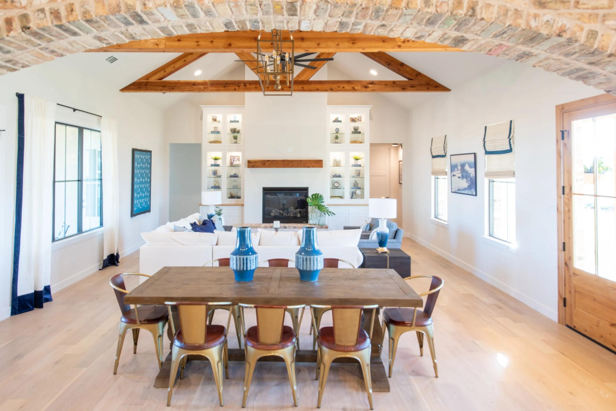
Celebrating Minimalism
I met Grant shortly after I moved to Houston to pursue my career in Interior Design. We attended the same church and two months later, we were engaged. A few years later, my sister, Laura, moved to Ennis, a small town south of Dallas. This lead us to take regular trips from Houston to visit them. Each time, we would imagine what it would be like to live there. Two years later, Grant got a job opportunity in Dallas, and that’s when we decided to make the move to Ennis with our 3 children.

Ennis, Bluebonnet Capital of Texas
My husband Grant and I planted our roots in Ennis...this town just drew us in. We had done the whole big house, big mortgage thing before, and we weren’t keen on doing that again. We love to travel, and it was important to us to still have room in the budget for this passion. We both love Europe and the European approach to life- simple and unhurried.

Outdoor dining area
With those desires at the forefront, we decided we would build what we could with what we had and add additional phases to the house in the future. A small, modern, Scandinavian approach was the right direction. We desired a clean and modern aesthetic with some antique and rustic pieces mixed in. Life with 3 kids can be very chaotic and messy! So this move was all about paring back and really thinking about what the necessities were for us.
The first floor is 1,150 sq. ft. and the lofts and playroom a combined 288 sq. ft. I had some major concerns prior to moving in.
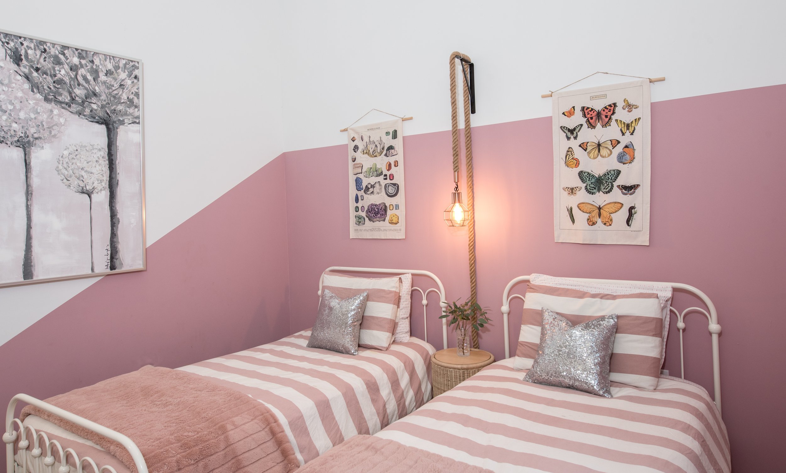
Girl room

Boy room

Retractable ladder to access upstairs playroom (custom made by: Iron Paws by Anthony Billingsley)

Upstairs playroom
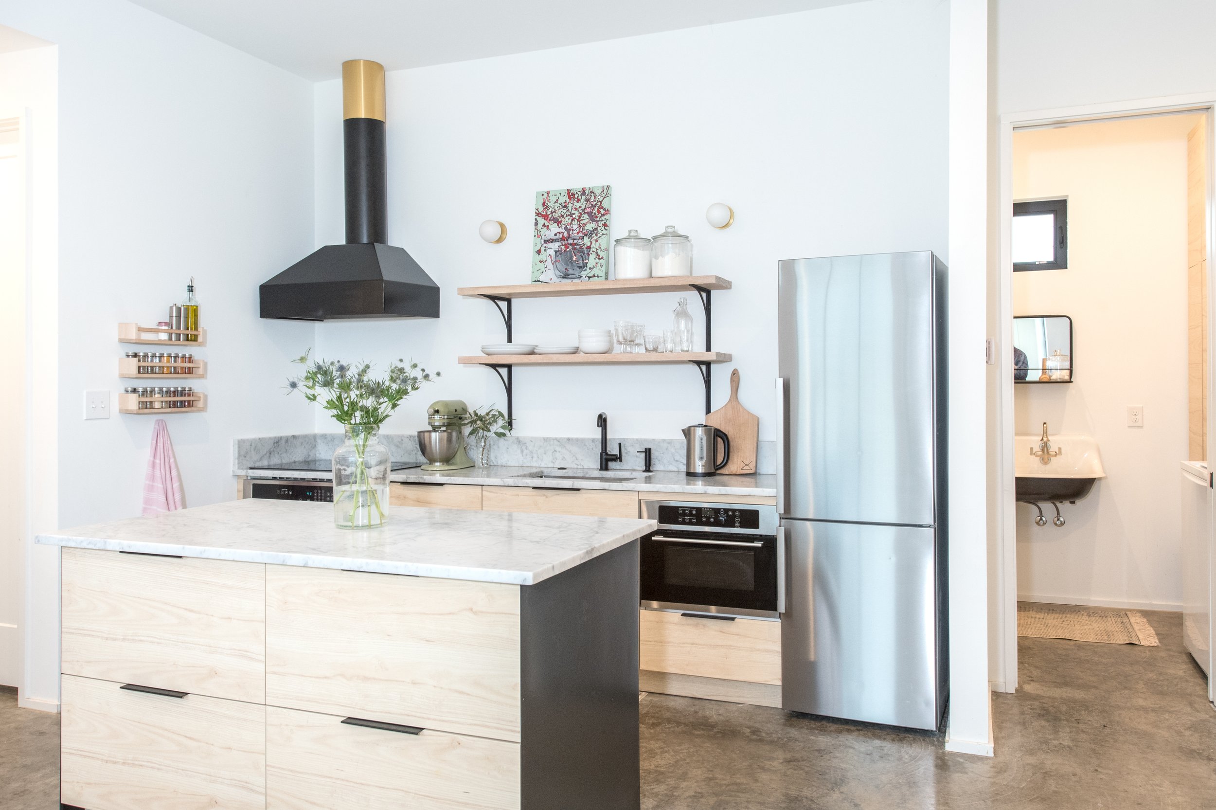
I was very worried being a family of five and only having a 24” refrigerator, smaller closets and minimal kitchen storage space. After moving in, those concerns quickly disappeared. I grocery shop once a week, and I’ve never had an issue fitting everything in the fridge. The only change I made was buying smaller sized condiments.
We have really minimized our clothes and gotten down to kitchen essentials. If something was a must-have or multi-functional it stayed.
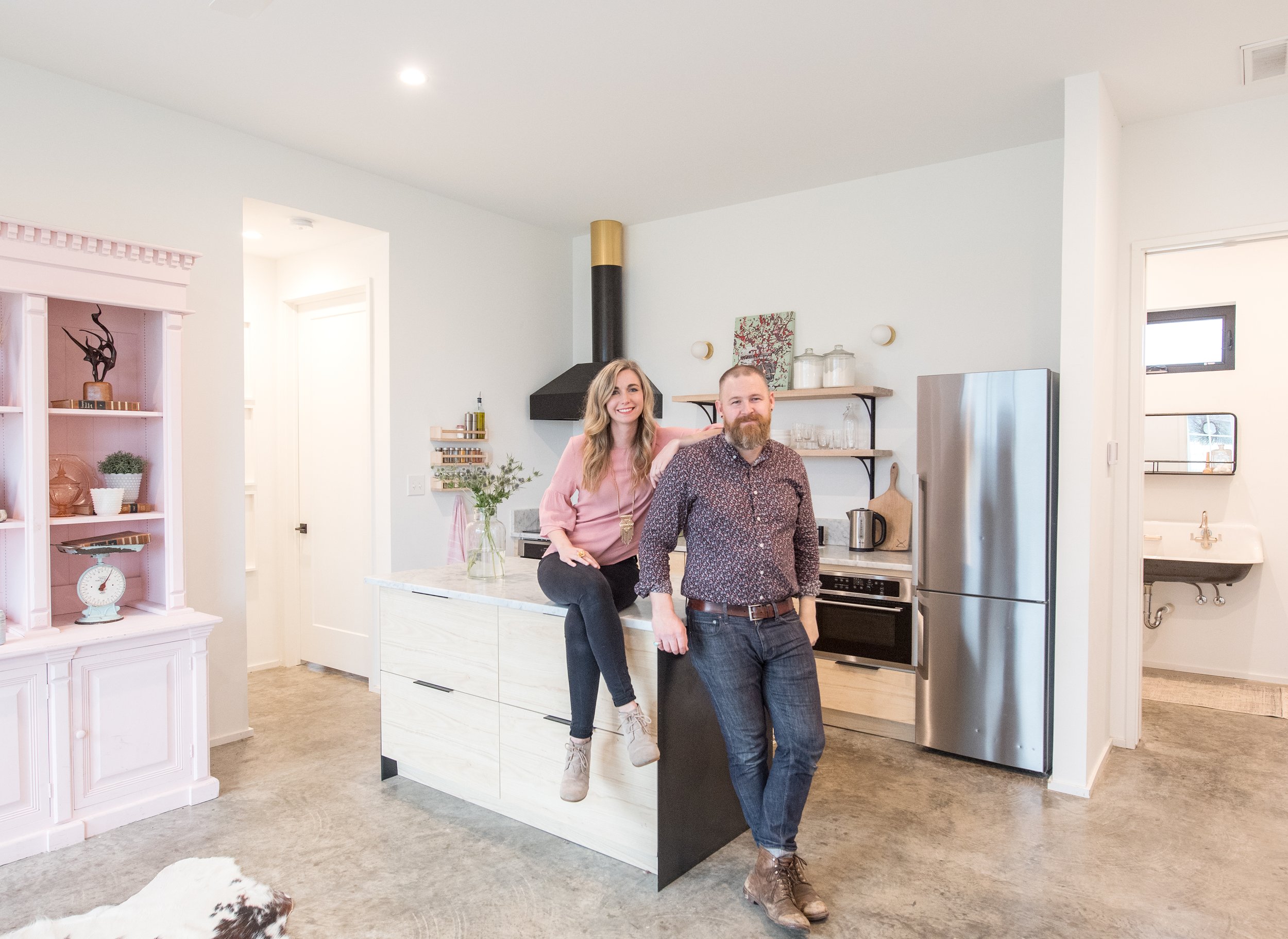
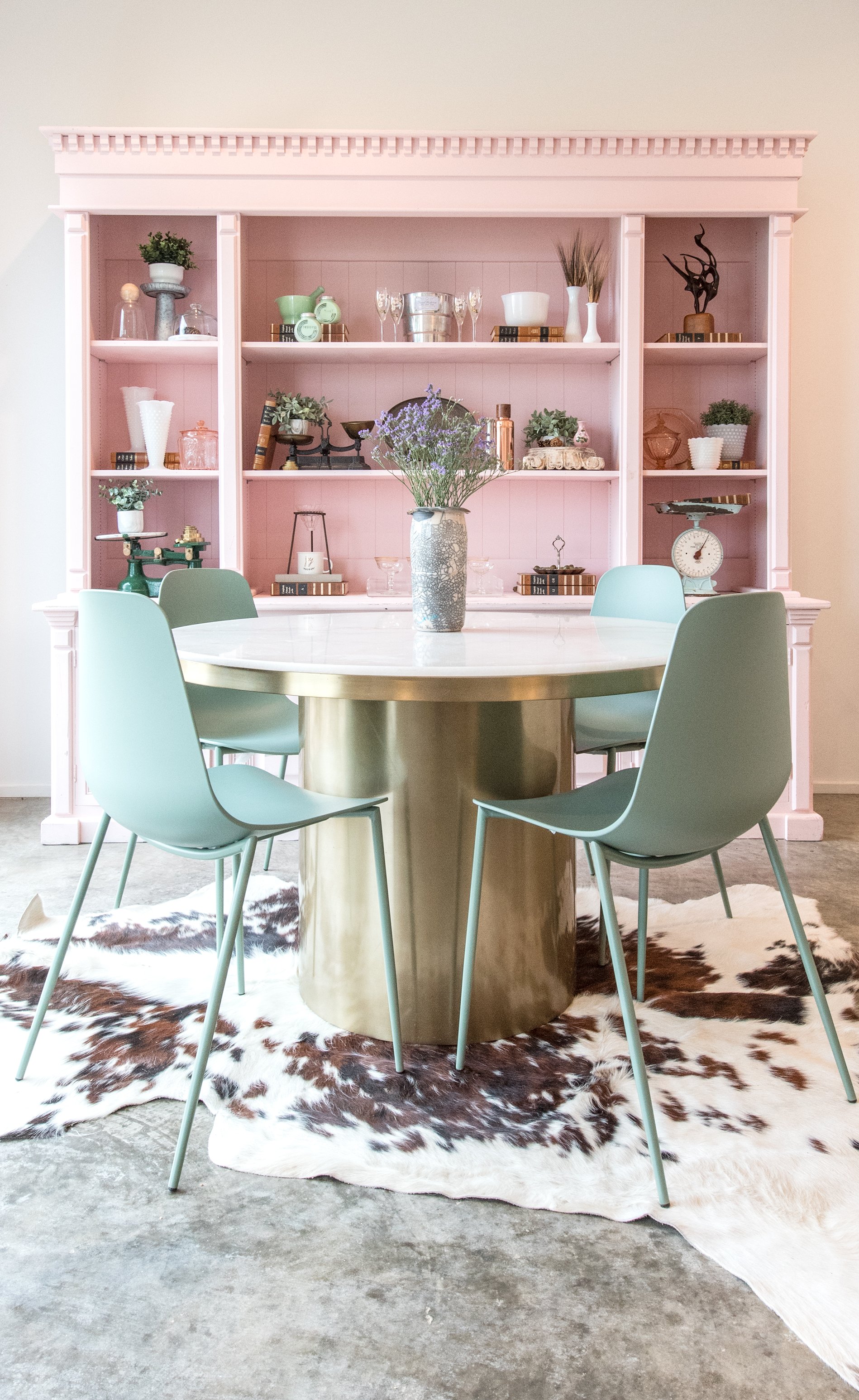
A large pink cabinet made by my dad houses our collection of scales from travels, glassware passed down from my grandmother and additional kitchen storage. When we get asked as to why we chose to use pink on such a large piece in the home, Grant will say, “When everything is white and minimal, you have the opportunity to incorporate some bold choices.”
A set of vintage lockers acts as our “mudroom”, all the backpacks, lunch boxes, jackets, etc. are stored within easy reach but out of view. The bathroom works double duty as the bathroom and laundry room and features a cast iron wall-hung sink and an entire wall of storage.

Cast Iron Sink

Laundry/Storage area in bathroom

Shower with metal enclosure (custom made by: Iron Paws by Anthony Billingsley)
Master Bedroom
Both Grant and I each had a must-have item on our list when starting the build. For Grant, it was linear air registers (which you would typically only see in a commercial space) and small recessed can lighting. “Working as a commercial architectural rep, I see the linear registers all the time and knew I had to have them in our home for two reasons. One, because I really love the unexpected aspect they bring and two, because I think it’s all of the little details that in the end, contribute to the overall feel of the house.” -Grant
For me, it was a library with a Harry Potter theme. I am a collector, treasure hunter, and avid reader. It was really important to have a quiet retreat where I could house all of my books and proudly display all of my collections. With floor-to-ceiling cabinetry painted navy, brass library lights and metallic gold stars on the ceiling, this room is totally unexpected with a menagerie of books and oddities alike. I fell in love with reading in the 4th grade, and I grew up reading Harry Potter and waiting for each book to come out and then each film. For me, Harry Potter is really the ultimate example of just how magical reading can be. I proudly display my very first copy of “The Sorcerer’s Stone” in a lucite box on the wall. The copy is noticeably tattered and well-loved.

Although it’s not for everyone, we love minimal living and feel it’s brought us closer as a family.

All photographs by Grant Duckworth Photography
Falling In Love With Your Home

It’s that time of year…time to pull out your fall decorations, your boots, and your cozy sweaters. Decorating for autumn doesn’t have to be a costly production. No need to reinvent the wheel…some dried florals, a few bags of pumpkins and seasonal throw pillows can go a long way to making your home feel like fall. My friend, Kari Saenz allowed me to pop in to her beautiful Ennis home to demonstrate how easy it is to transition your current decor into fall decor with these few items. Here are some fall styling tips that will make the perfect landscape for you and your family to enjoy all of your favorite autumn activities.
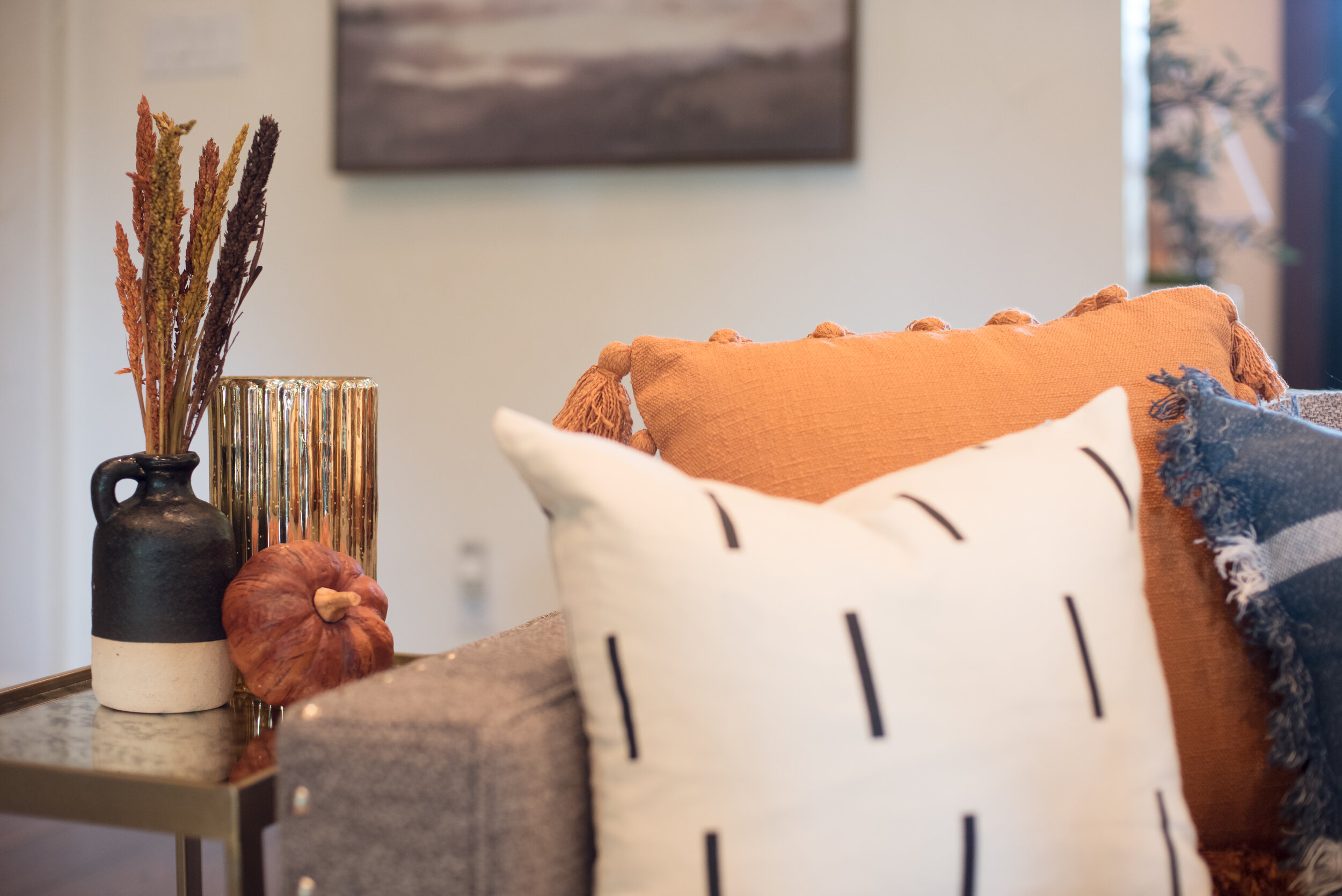
It’s good to keep in mind the Rule of Three. Creating a “trio” of items in varying heights and textures is pleasing to the eye. For example, in this first grouping, we have an end table with a vase, dried florals, a mercury candle holder and a small pumpkin. On the sofa, we’ve brought in three pillows: a large orange pillow with tassels, a medium blue plaid pillow, and a small black and white pillow.

Add a tray to your ottoman or coffee table and top it with a seasonal grouping. Have a plaid blanket accessible for chilly nights and a fall feel. Here, we used some books with vases with seasonal dried botanicals and a pumpkin.

Dress up a bookcase or console table by adding a few pumpkins and dried stems in with the existing decor.

For the fireplace, we layered a seasonal wreath on top of the existing art. We also added fall colored candles, a basket with cozy blankets and seasonal filler to a glass lantern.
See how easy it can be to add a few seasonal items to your existing ones in order to elevate your decor? This subtle approach is a tasteful take on stylish seasonal decorating.

See our latest article here in the October/November issue of Ellis County Living Magazine.
Client Spotlight: Suzanne Ford
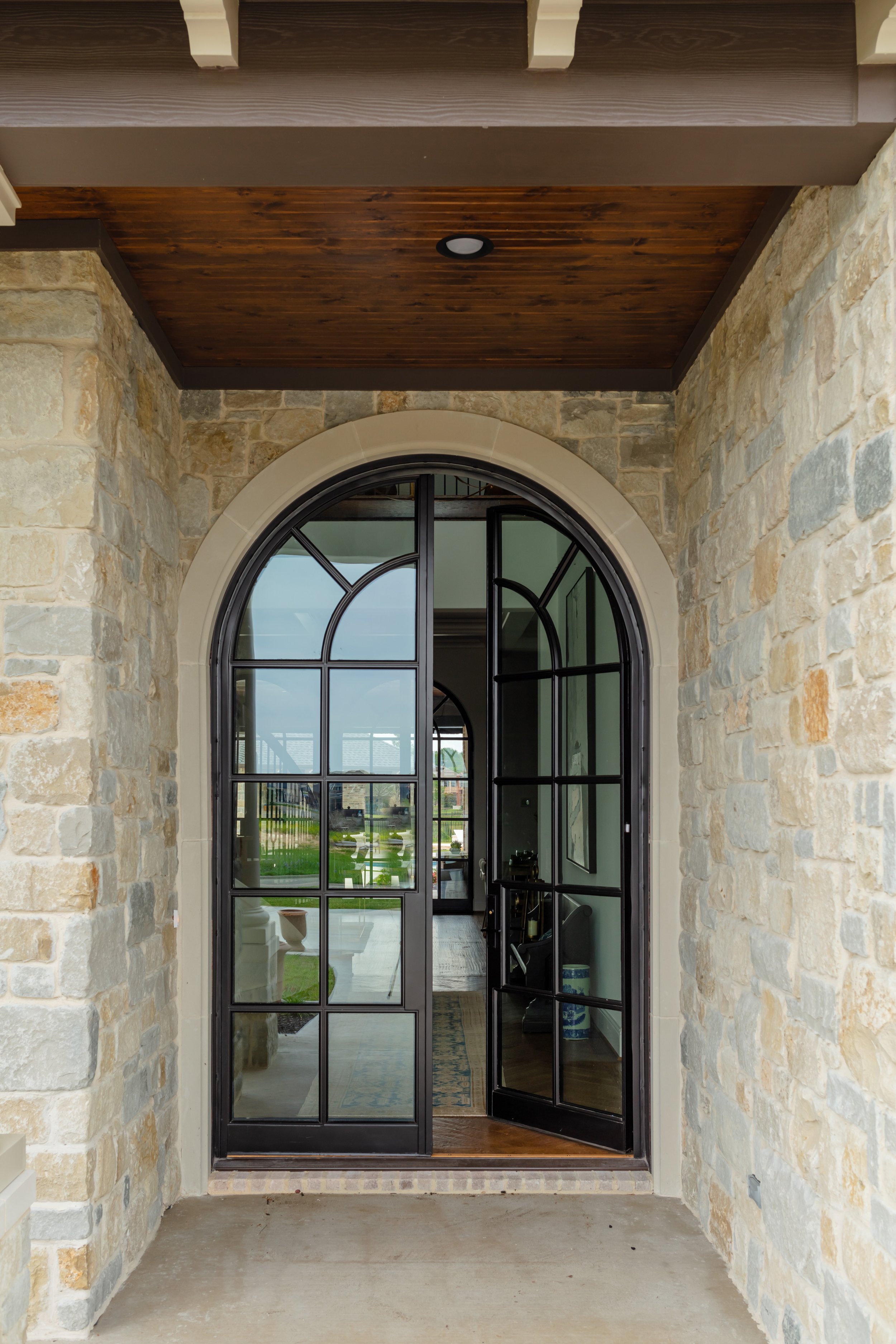
Our French Acadian project continues to be one of the most popular houses we’ve been fortunate to work on, and we thought you might enjoy a Q & A with the owner. Meet Suzanne… one of our precious clients and owner of the French Acadian house. Suzanne won us over quickly with her bright smile and charming Southern accent. She and her husband had a clear picture of what they wanted for their custom home, which made our job really easy. What does the style “French Acadian” even mean? I’m so glad you asked!
Towards the end of the 17th century the French settled in the lower Mississippi Valley. Acadian and Cajun are used as broad terms today in Louisiana and don’t necessarily refer to descendants of deported Acadians. Louisianians of Acadian descent are also considered Louisiana Creoles. Creole and Cajun are often considered separate identities today. However, most Cajuns are of French descent and make up a large portion of Louisiana’s population. It’s impossible to ignore the huge impact Cajun’s have had on Louisiana’s culture, including the prominent architecture style.
The French found their new environment more hot, humid, and prone to flooding than their European country. Louisiana architect A. Hays Town is credited with reinterpreting the French Acadian architecture style, taking into account the environmental differences. He used large roof overhangs, breezeways, and cross ventilation.

For more on A. Hays Town, we recommend this book. You can purchase a copy here.

DI: Why did you want to build a French Acadian home?
Suzanne: My husband and I have family in south Louisiana, and we have spent a lot of time there. We were inspired to build a French Acadian style home after seeing the work of architect A. Hayes Town. We loved the exposed brick and natural woods that he used in his homes, as well as the capability to combine that with modern features. It's a look that stands the test of time in our opinion and is very inviting for our family and friends.

DI: What was the most challenging aspect of building a custom home?
Suzanne: For us, the most challenging thing about building a custom home was making sure our ideas were completely represented in the final outcome. We knew exactly what we wanted but felt overwhelmed at times with the selection process. Kate was there to guide us through most of it, and that helped tremendously!

DI: What was the most helpful aspect of working with Duckworth Interiors?
Suzanne: Kate kept things organized throughout the building process. My ideas were all over the place, and she did a great job of putting it all together! She would set up the meetings and appointments for selections and was invested in making sure things got done in a timely manner. She was able to bring my ideas to reality.

DI: Which room in your home do you enjoy the most and why?
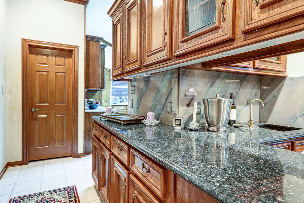
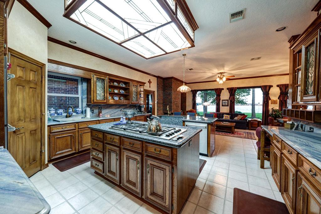
Suzanne: I really love my kitchen and the time we spend there as a family. The large island and open breakfast areas are great for entertaining family and friends. The reclaimed wooden beams, Shaws sink, marble countertops and brass pendants are my favorite features. We love to cook and entertain, so we spend a lot of time in this space!
DI: What’s your favorite wine?
Suzanne: My favorite wine is DuMol Vineyards Pinot Noir. It pairs really well with pasta- my favorite!
We hope you enjoyed our Client Spotlight with Suzanne! Now, it’s your turn…what’s YOUR favorite wine? Let us know in the comments below.
To read more about the French Acadian project, you can check out our other blog posts about this house here and here.
Duckworth Interiors is 10!

10 years? Have we really been in business for TEN whole years??? Wow. We’re going to just take a minute and let that soak in over here. We feel honored and humbled to have been supported by our amazing clients for so long. That you guys continue to trust us with something so big, so personal - your homes. We’d love to take a look back at this journey that has led us to where we are today. Maybe you’ve been with us every step of the way or maybe you’ve just found us. Either way, take a trip down memory lane with us.

Well, it all started with a girl from Little Rock, Arkansas. This one 👆🏻…. Me. I was graduating from the University of Central Arkansas and needed a design internship. I had a sister (Laura) living in Houston and decided to include H-town as an option in my search. I found my internship in Houston doing model home design. After my internship, I joined a high-end residential firm where I worked for two years. After that, I began working with my brother-in-law building custom homes. This is where my design firm began, originally called Maison Market. I continued to office with my brother-in-law for about a year until a gem of a place became available in Old Town Spring in Spring, TX in August of 2011. It was a 2 story white Victorian house built in 1895. I put in a boutique on the first floor and office on the second floor.

The boutique eventually closed, and I zeroed in on my focus as a designer, specializing in new construction selections, turn-key interiors and remodels. As business grew, there was need for my own warehouse and office space. We moved to this great studio in Magnolia, TX.
During this time we decided to rebrand, changing our name from Maison Market to Duckworth Interiors. We unveiled a new name, logo, and website.
We had so much fun in this space, hosting events and pop up markets.
We stayed here for a few years until we decided to make the move to right outside of the Dallas area, Ennis to be exact. We fell in love with this adorable town and we’re so happy that we’re here. We’re now in the heart of downtown in this beautifully restored building.

To date, we’ve worked on hundreds of homes across 10 cities, had our work published numerous times and won a slew of awards for our designs. We’ve done a lot, but in so many ways I feel like we’re just getting started. We’re just beginning to find our stride, and I’m SO excited for what’s to come! Here’s to the next 10 years! Thank you for being a part of it!
-Kate
Creating a Master Bedroom Oasis

There are two types of people: people who are confident in designing their home and those who are not. Not everyone has the belief in themselves to pull together a room, but everyone desires to have a a soothing retreat where they can find respite from the day. We’ve taken the guesswork out and complied some simple “rules” on how to pull together the bedroom of your dreams.
Deciding on a color palette/design aesthetic is the first step. Do you like moody and cozy (dark colors and warm stains); bright and calming (light colors and gauzy fabrics); elegant and refined (neutral colors and ornate details)? Once this is decided, you can see if there are any architectural details to add to the space, like adding faux shallow wooden beams to the ceiling.
To create a focal point for the room, choose something bold for the wall where the bed rests. You could do a variety of things to accent that wall, from wallpaper to shiplap to a daring paint color. Don’t be afraid to make an adventurous choice…it’s just one wall, after all!

Speaking of the bed, it is the perfect place to add texture, dimension, and/or color. One suggestion is to mix up the furniture pieces in the room. If you’ve got a matching set, don’t be afraid to break the set up and relocate some pieces to a different room. You could also choose to paint the night stands an interesting color. This makes the room more visually interesting and gives it a more collected feel. If you’re purchasing a new bed, be sure the headboard is tall enough that once pillows and shams are on the bed, it doesn’t disappear.
Once you’ve chosen the furniture for the room, it’s time to select the bedding. Choosing layered bedding adds textures and colors and makes the room feel complete. To incorporate a variety of textures, select a quilt with a folded duvet at the foot of the bed. A rug can also reinforce the mood and color palette.

Another way to control mood and ambiance is with lighting. A dimmer can be installed for your general lighting to adjust the environment. If you’re willing to part with a ceiling fan, add a chandelier. It can go a long way to contribute to the design aesthetic. A pair of lights on either side of the bed can further contribute to the aesthetic: from lamps to pendants to sconces…the sky is the limit!
Just because designing doesn’t come easy to you, doesn’t mean you can’t do it with the proper guidelines. A master bedroom oasis is closer than you think.

Check out our article in Ellis County Living Magazine and follow them on Instagram: @elliscountyliving.
Project Reveal: Steampunk Lake House Remodel
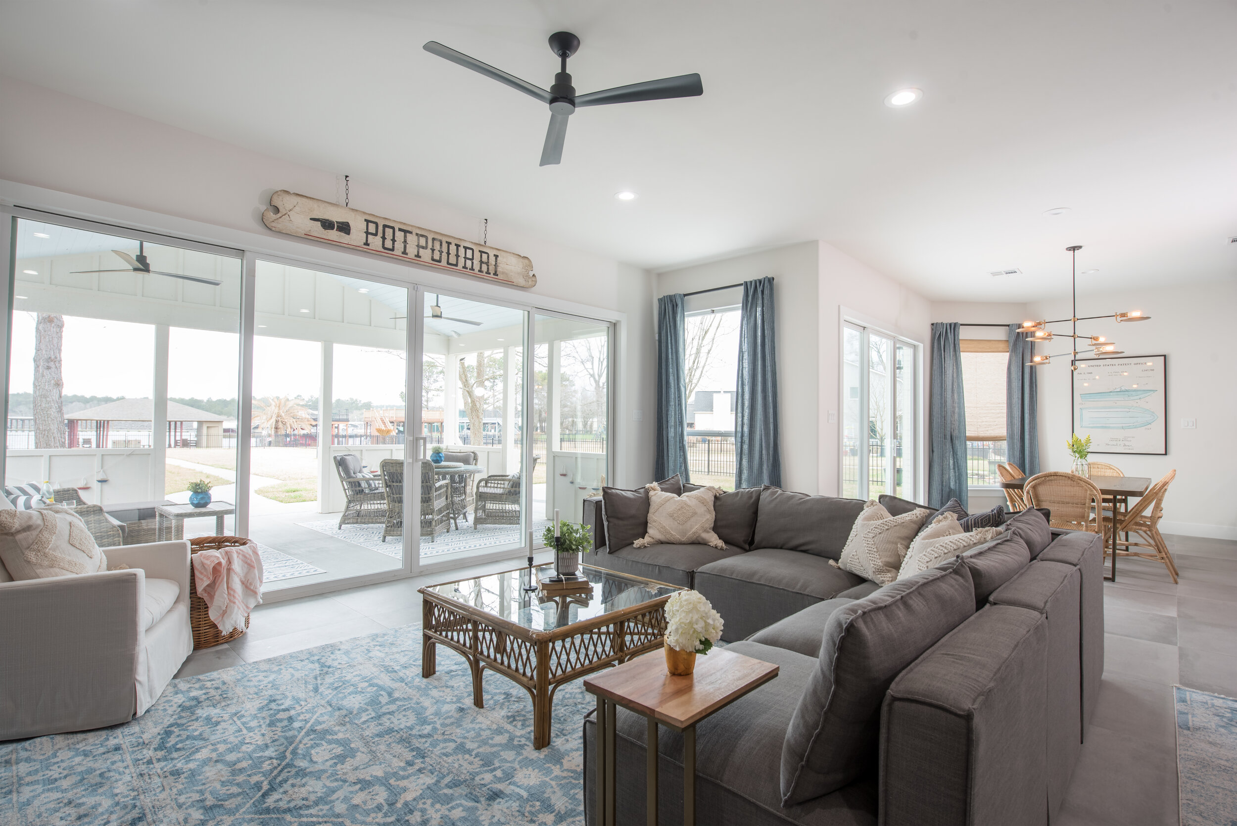
Our clients purchased this 4 bedroom, 3-1/2 bath waterfront home on Lake Conroe in Conroe, TX. The home was a gem when it was built in 1997, but it needed a little polish and shine. Our clients have three kids and love to entertain. They are a laid-back and fun family, so the interior needed to be welcoming, durable, and kid-friendly. They gave free design reign over the entire home with one request: they wanted it to be “steampunk.” This is a design style inspired by 19th-century industrial steam-powered machinery. The clients love this quirky look and wanted it incorporated into their decor.

The design dilemma was to merge the two very different styles: steampunk and lake house. This was a challenge I was excited to take on! As you peruse the photos, I think you’ll see the ways we incorporated the steampunk elements by way of lighting, plumbing fixtures and accessories. We found many vintage and upcycled items, such as a motorcycle-gas-tank-turned-art, a bowler hat, bicycle seats and taxidermy. These items were then juxtaposed by all of the lake elements: casual linens, natural and raw elements, and an array of blues.

You’ll notice the foyer previously had 20-foot ceilings with an upstairs landing that overlooked the front door. We decided to close it in. This achieved several things: it added square footage to the house (increasing its value), added another room upstairs, and created more of a sound barrier between floors. You’ll also notice, we were able to repurpose the coat closet into a downstairs powder room. The stairway was modernized with iron railing and wood treads and risers. An industrial light was added, along with updated flooring throughout the home.


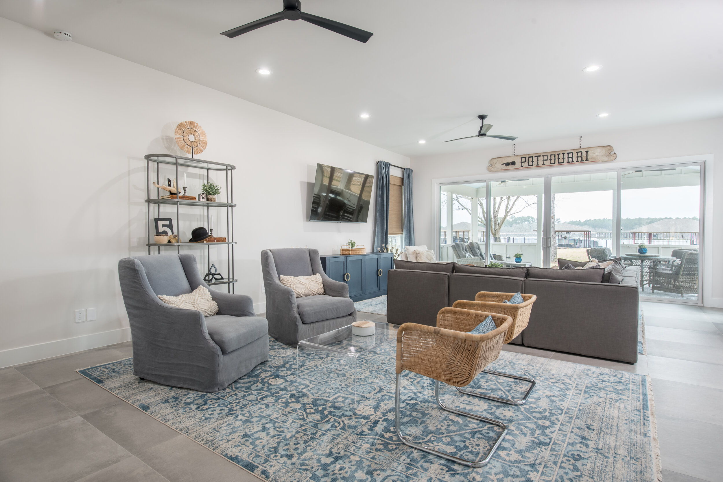
In the family room, we removed the fireplace and pushed the exterior wall out to the end of the existing covered porch. This created an oversized living space that allowed for two separate seating areas. Expansive glass sliding doors were also added in the family room and dining room to maximize the lake view.

We utilized the space under the staircase for an adorable “Harry Potter Room.” Any chance I get, I love to carve out fun nooks and crannies for kids spaces.


In the kitchen, the original pantry was replaced with an oversized refrigerator and freezer. A larger walk-in pantry was created by repurposing space from the new kitchen layout. A butler’s pantry was added, utilizing even more of the unused space under the staircase. We removed the kitchen window and relocated the sink to the island in order to help bring more attention to the hood and range.


The Dining Room space also benefitted from the expansion of the exterior wall. A sliding glass door was added, as well as an asymmetrical, modern light fixture. The wicker chairs continue the light, airy lake feel into this room.


One favorite detail is the boat art, pulling in the lake vibes and the blue theme.

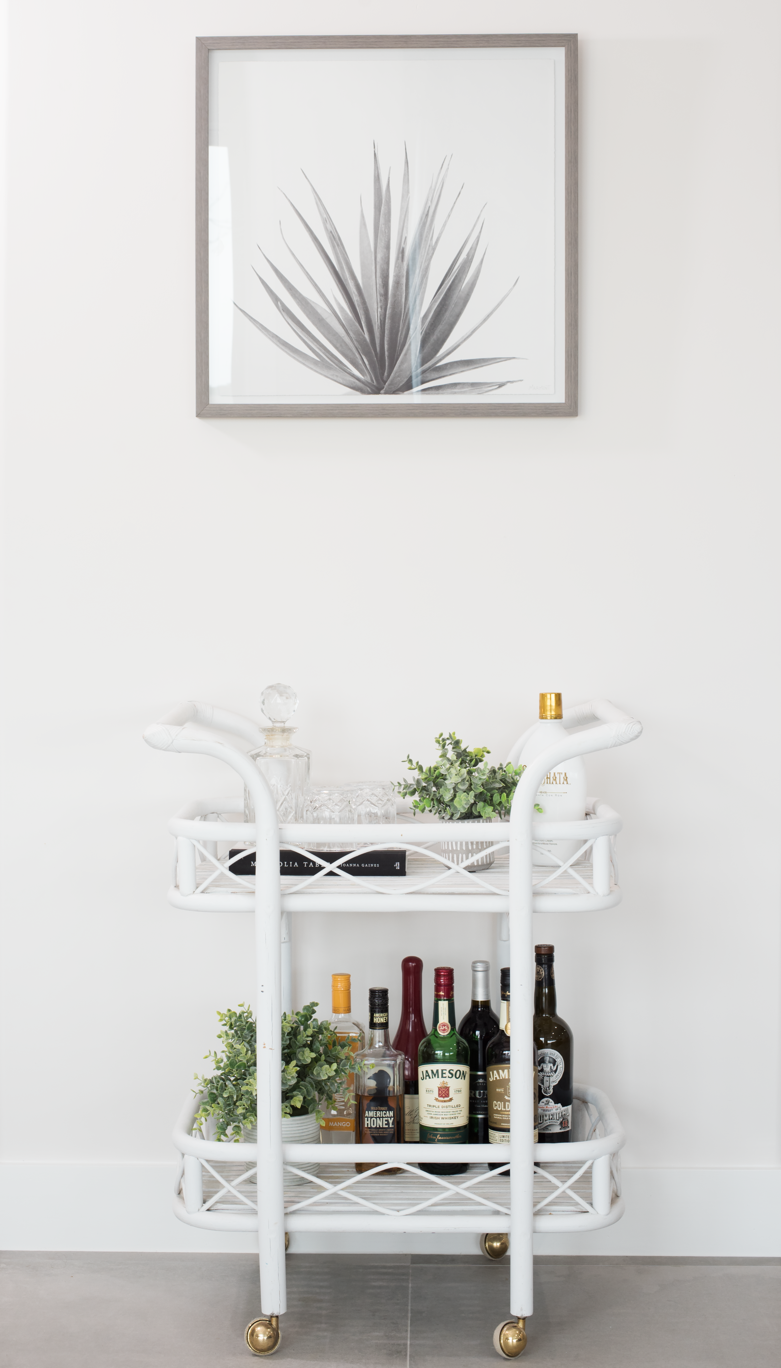
Between the Dining room and the family room is this darling bar cart.

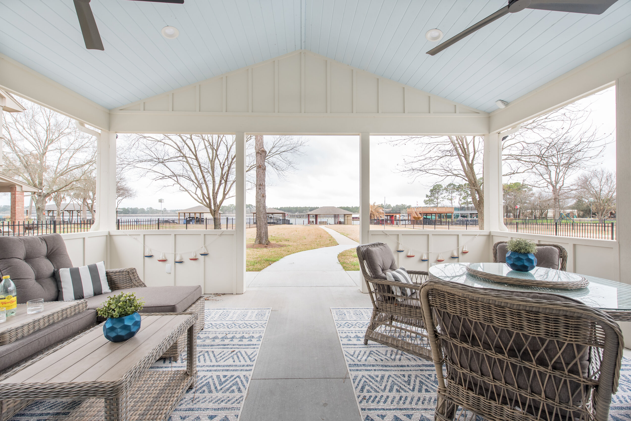
The covered lanai was transformed into an outdoor oasis, including outdoor seating and dining with matching cozy rugs.
In the master suite, we added windows and a sliding door, allowing for more natural light and lakefront views. The dual flooring materials broke up the space and made it feel smaller, so we replaced them with the same flooring used throughout the first floor. The bed was moved to a different wall, where we added a blue and metallic wallpaper.


In the all-black-and-white master bathroom, we changed the orientation of the water closet and removed the jacuzzi tub, replacing it with a large shower.

I mentioned how fun these clients are, and you’ll see their sense of humor showing through in the candid message “get naked“ in the tile design!


A freestanding tub was added on the back wall, creating an inviting space to unwind and relax.

The upstairs has a game room with four bedrooms and two bathrooms. By extending the back wall of the game room to match the newly-captured family room space below, we were able to add a stage to compliment the large sitting area.


One of the upstairs bedrooms was converted into a comfortable, inviting guest suite that doubles as a home office.


The Jack and Jill bath received a complete makeover.


In the daughter’s bedroom, we built the color pallet of the room around the fine art piece above her bed: turquoise, orange, and pink. A vanity area was added with an orange stool. The turquoise made an appearance in her Jenny Lind bed and drapery. The leopard print rug and white fur bedding added a touch of whimsy.


And, check out her darling reading nook/closet!
In the oldest son’s room, we went with an orange, navy and grey color pallet. Texture was added with a “wave” patterned wallpaper. Orange lockers were used as night stands and provided additional storage.

His en suite bath also received a complete facelift. We brought the navy into his bathroom, as well, with the navy tile and vanity.


And, remember the room we gained by closing in the foyer? This petite, adorable nursery is the result.

We hope you enjoyed your tour of our #steampunklake project!

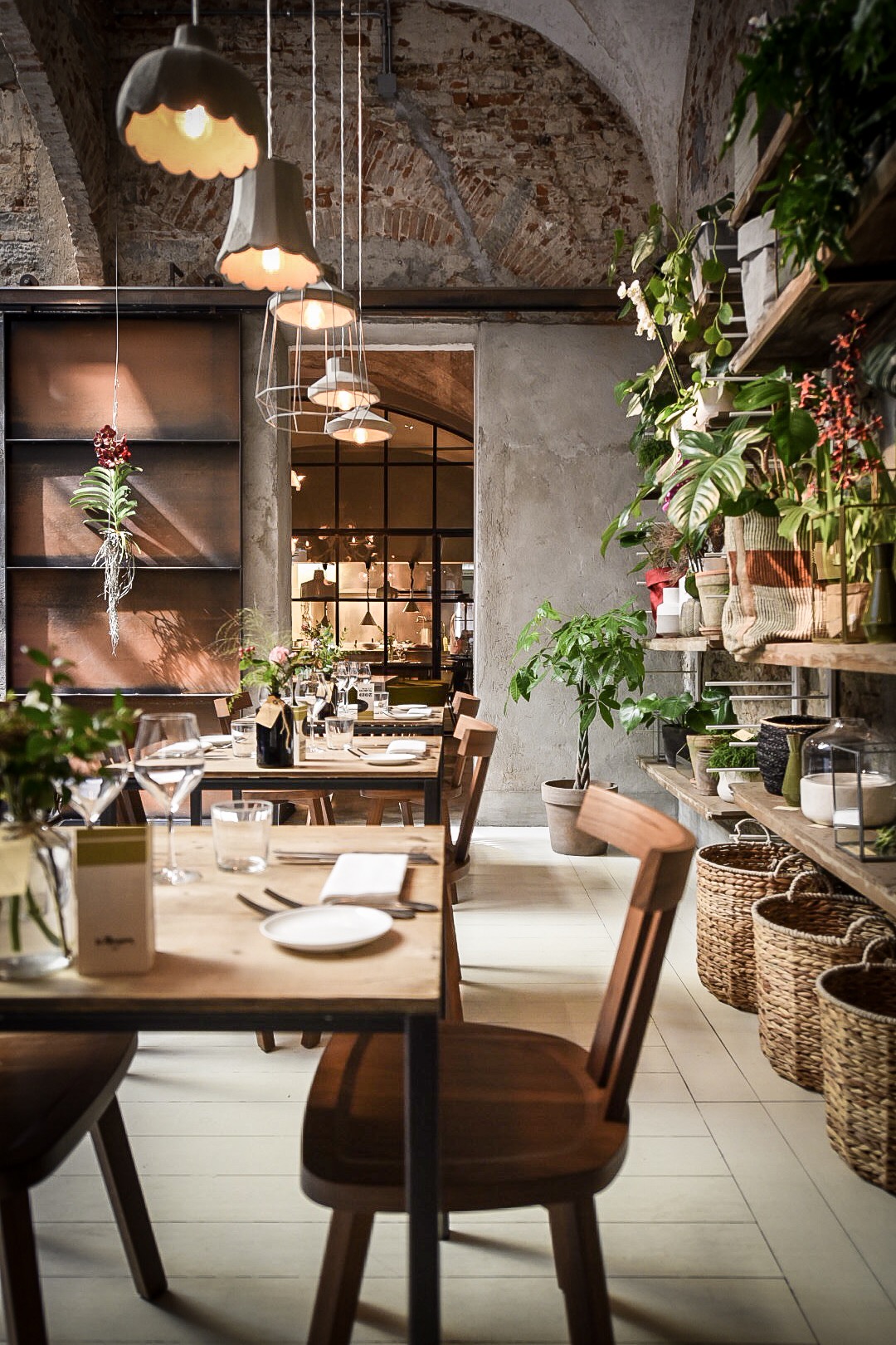
Incorporating Plants Into Your Decor

With springtime upon us, many of us find ourselves motivated to freshen up our homes. What better way than to incorporate houseplants into your decor? Plants have many benefits to your health and well-being. Well known to purify the air, they have other lesser known benefits. Along with reducing anxiety and stress, plants boost immunity and healing. It’s also very rewarding to care for a living thing and watch it thrive!

Create a cozy spot on a bench in your foyer or mudroom. Utilize a tray to group a small plant, a couple of books, & a candle. Add some pillows and a throw.
If you’re busy and on the go, you may think you don’t have the time to care for houseplants. I always thought of the typical “plant person” as someone that was retired or had lots of time on their hands. After getting a plant of my own, I realized quickly that it not only brought joy to my life, but didn’t take near as much time to care for as I thought it would.

Bring some life to your nightstand. Layer lamp in front of some art. Add a small plant on top of a couple of books.
Once you decide to take the plunge and buy your first plant, it can be intimidating to decide which one to select. Walking the isles of the plant section is exciting and overwhelming. My advice is to select a plant that speaks to you, that you enjoy looking at, like a piece of art you’d choose for your home. Some varieties we love for style and ease of care are ZZ Plants, Snake Plants, and Polka Dot Begonias. After the plant is selected, it’s time to select a container. Look for a pot that you love and goes with your decor. Be sure it’s slightly larger than the container your plant comes in.

Liven up a foyer console or a dining buffet. Create a grouping of three items on each side.
Next, you’ll want to think about where to put your new friend. Do you want a larger plant to put in a corner of a room as an anchor? Do you want a smaller plant to put on a shelf or a night stand for a splash of color? Do you want a few different plants in varying size and texture to put together in a grouping? These are good things to think about when incorporating the plant into your design.

Incorporate a plants on your side tables. A lamp, a plant, and some books. Don’t forget to leave some room for your favorite beverage!
We spend so much time indoors these days. Once you start bringing the outdoors into your spaces, you begin to realize how much life, vitality, and energy they bring with them. Whether it’s a small plant on your desk at work, some fresh herbs in your kitchen, or a sturdy tree in your living room, they are sure to bring you joy. Warning: Once you begin your collection, it may become an addiction.

Have an empty corner? Try a grouping of plants on stands. Make sure you use a variety of planters and different materials on the stands to add visual interest and texture.

Fiddle Leaf Fig Tree, Audrey Ficus, Snake plant (From largest to smallest)

Duckworth Interiors was honored to be contributors in the February/March Edition of Ellis County Living Magazine. See the article here.
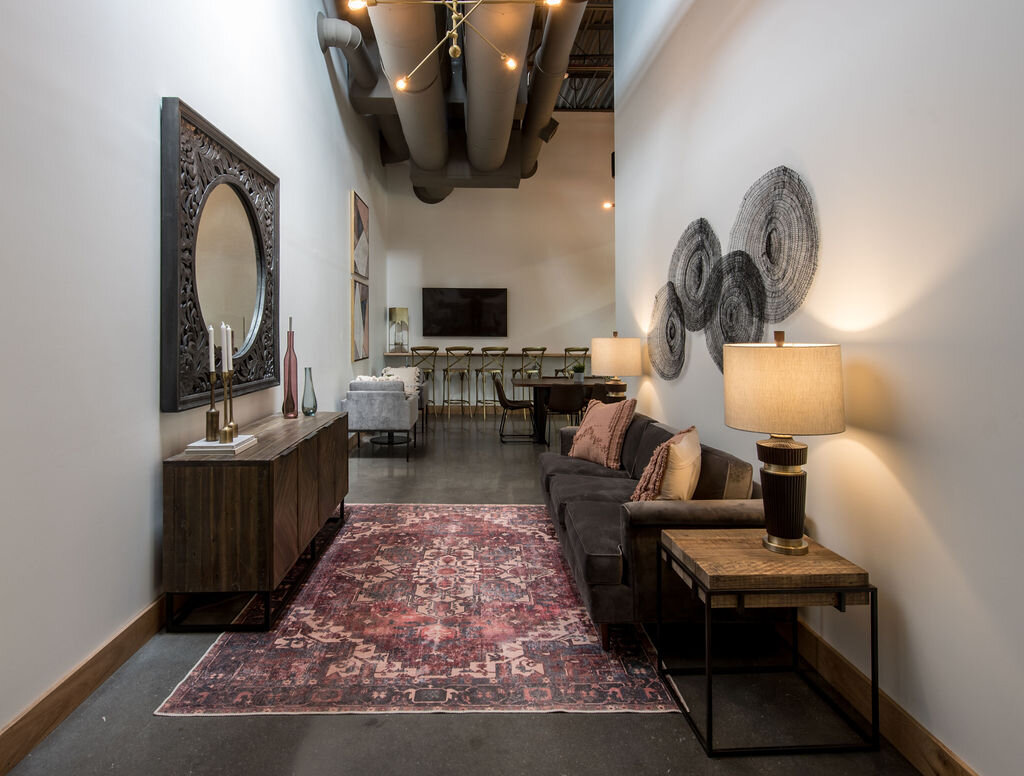
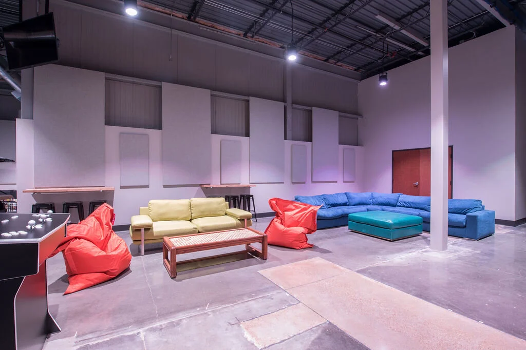
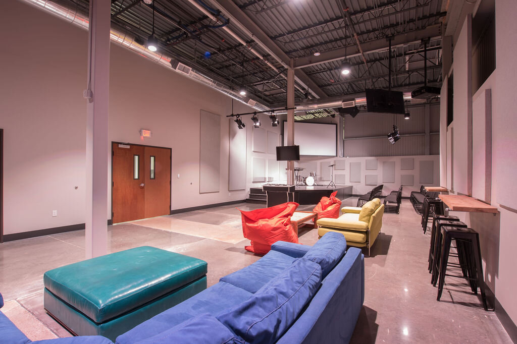
Project Reveal: Church Remodel
I’m so excited to finally reveal the largest project we’ve worked on to date! When the church that I call home purchased an old grocery store to become our new campus, I knew we had to get involved. For this project, Duckworth Interiors provided the architectural drawings, the construction selections, and fully furnished the interior. The contractor for the remodel was FBM Construction and the beautiful photos are by Grant Duckworth Photography.
One reason this project was so appealing was that this wasn’t just going to be another church, it was really going to be a place for people to meet and interact. With a coffee shop, indoor playscape, and lots of seating areas open everyday, this is a much needed place for the community. Whether you need an inspiring place to camp out with your laptop and get some work done, something fun to do with your kids to escape the Texas heat, or just to grab a coffee with a friend, I’m proud to say we’ve created the perfect spot in Ennis, TX.
Overall you’ll notice a modern, industrial aesthetic but in a few areas we have a nod to boho as well. Let’s start our tour, shall we??
With the building only being a few years old, the exterior was in great shape. It just needed some paint, and some new signage. The only major thing we did was add a second entrance on the right side of the building.

When you walk in the entrance on the right side you’re greeted by “The Hub”. This is the place to go to on Sunday morning when you want to buy some merch or you’d like more info about something.

Notice the island is wrapped in cedar plank and the back wall is tiled with large-scale black hex. The pendants are concrete with Edison bulbs, hanging from different color cords. I just love these!

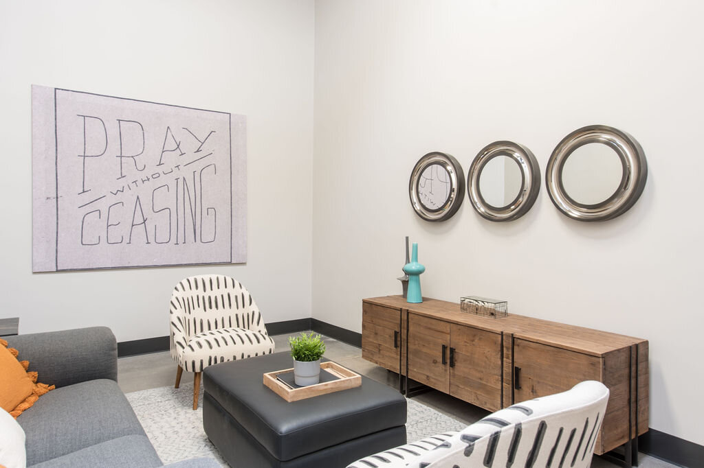
If you noticed the 2 sliding glass doors on either side of The Hub, they lead to the Cafe seating area, which is a U-shaped room just behind.

Each end is identical, featuring a live edge table with leather chairs to seat 6, a cafe table with 2 arm chairs, and a bar ledge to seat 7. Screens above both bar ledges will show Sunday morning sermons for those that would like to watch from here.
The middle section of the “U” has a sofa and credenza. The art in here consists of some geometric paintings, an ornate carved mirror, and some woven metal disks that we hung and played on the wall.


On either side of the cafe there are 2 doors that lead into the worship room.

At the back of the worship room, you’ll find the prayer room tucked in the corner.

Now, let’s go back out into The Commons to explore the rest of the space…

To the left you’ll see the men’s, women’s and family restrooms.

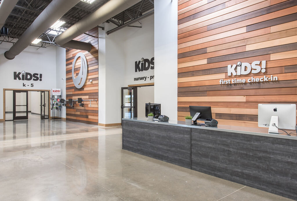
When you walk in the main entrance, you’ll find the first time check-in and returning check-in. You’ll also find 2 hallways, one that leads to the Nursery-Pre K classrooms and one that leads to the Kindergarten to 5th grade classrooms.

You’ll also notice the playscape!! My kids have throughly tested it, and it received RAVE reviews.


At the other end of The Commons is the coffee shop. This is previously where the grocery store’s pharmacy was located. We repurposed the prescription pick-up as a drive-thru for the coffee shop!


There are also several seating areas along the commons where folks can watch the sermon, have a coffee, or watch their kids play.


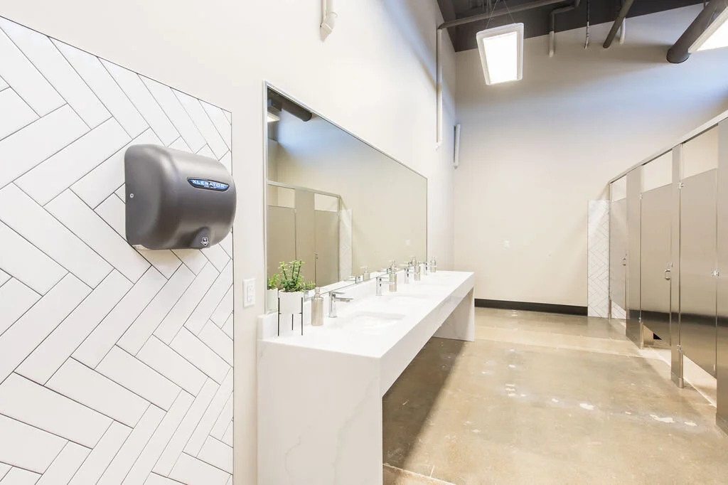
Here’s a look inside one of the restrooms.
When you head down either of the children’s hallways, you’ll notice MANY classrooms and they’re all different. I can’t show you all of them, but here’s one. We utilized carpet tiles by FLOR throughout these spaces. Down each hallway there are also children’s worship rooms.

The volunteer room is just off the commons, and it’s a great place for volunteers to put their belongings in a locker, pray together, and ready themselves before each service.

Here’s the nursing mothers’ room. I love that the mamas have this beautiful and comfortable space to use when needed, and they won’t miss the sermon because it’ll be on the screen.

Now we’re going to head to the very back of the building, where the loading docks to the grocery store were/are. This is the student’s room, 6th-12th grade. They have an awesome hangout, worship area, and sports court just outside the back door.
Now we’re going to head to the church offices where you’ll find a conference room, reception area, and staff office spaces. Here’s the reception area but also a great spot for a staff meeting.
Here’s one of the church offices. Each one has a work area and lounge area.
And finally, we’ll end our tour by heading to the back of the house. Behind the worship room, you’ll find the production room and the green room. Here’s the production space…

Now let’s head down to the green room…

And what color did we paint it? Green, of course! This is a really cozy space for the musicians to hang out before and between services. And when I say “hang”, I literally mean they can hang from the ceiling in swings!


I hope you enjoyed my tour! Please leave me a comment and subscribe so you don’t miss out on our next project reveal. I hope that you’ll come check out this awesome space as soon as it’s safe to open. Lot’s of love and thought went into it!
-kate
Project Reveal: Conroe Lake House: Before & After
I was approached by one of my favorite clients to help remodel and fully furnish a lake house they were about to purchase on Lake Conroe. This house was luxurious in its day but was dated. It was just begging for someone to make it pretty again. Starting with awesome bones and adding in a super talented team, I am thrilled to show you it’s transformation! Wyrick Residential Design did the plan design, Jameson Custom Homes did the remodel, Duckworth Interiors provided the construction selections and full interior, and IronPaws by Anthony Billingsley made all of the custom ironwork (Stairs and Wine Room). The beautiful after photos are brought to you by Grant Duckworth Photography.
These dream clients gave me FREE REIGN to do whatever I wanted to this lake house! Yep, you heard me. I mean any light fixture, tile, plumbing, paint, wallpaper, furniture, art, you name it. Didn’t even have to ask! So, needless to say, I had a LOT of fun on this project! Let’s start the tour…
The exterior…

Front Elevation: Before

Front Elevation: After
The exterior really didn’t need much. We painted the brick, replaced the front doors and exterior lighting, added some shutters, and spruced up the landscaping.

Front Elevation: Before
It always amazes me what a fresh coat of paint can do!

Front Elevation: After

Rear Elevation: Before
In the back, we removed the balcony and added a huge covered patio, outdoor fireplace, metal roof accent, and gigantic windows to maximize that stunning view!

Rear Elevation: Before

Pool: Before
The gorgeous pool was already there but had a lanai around it. The home owners wanted the lanai taken down, and afterwards I was SO surprised at how much closer the pool felt to the lake.

Pool: After
Let’s head inside and take a look at the old foyer! I told you, it was begging for someone to make it pretty again. It’s hard to see here but there is a step down from the foyer to the main living area. Because we wanted to make this all one level, the staircase had to be removed and rebuilt…

Foyer: Before
Doing so allowed us to bring in my childhood friend and very talented metal artisan, Anthony Billingsley (Iron Paws by Anthony Billingsley) to create a custom staircase that turned out to be such a stunning sight when you walk in the door!

Foyer: After
I love that we got to remove the wall under the stairs to allow the staircase to float. As you can see, Anthony is extremely talented!

Foyer: After
I don’t have a before picture of the next room, but opposite of the staircase was a formal dining room. My clients aren’t really formal kind of people and wanting to maximize the amount of bedrooms in the home, they decided to close this room in and make it a second master on the first floor. We also stole some space from the laundry room to add an en suite bath.

Foyer: Before (Entrance to formal dining on right)

Bedroom: After
You guys, I just love this bedroom so much! We chose a natural grasscloth for the walls, Tommy Bahama banana leaf drapery, and some blue accents.

Bedroom: After

Bedroom: After

Bedroom: After
Now let’s head into the main living area, there’s lots to see here! Here’s our casual dining area before…

Casual Dining: Before
I mean, such a transformation! So here, we replaced the windows with a huge butted glass window. We dressed the window with an operable sheer drape for the occasional need to filter the sunlight. We added these great light fixtures and of course new flooring, trim and paint throughout the home.

Casual Dining: After
Previously, there was an awkward brick fireplace where you see the built-in now. Removing the fireplace allowed for more storage, a dining serving area, and really lightened up the room.

Casual Dining: After
Adjacent to the causal dining area is where I think you’ll see the biggest transformation! First of all, just to the right in the photo below was a second stair case which we eliminated. Also, notice the balcony above, where the upstairs game room overlooks the family room. I had to do lots of persuading, but I finally convinced everyone involved to extend the second story all the way to the rear elevation. This achieved so many things… it closed off the game room so that all of the laughter, fun, and games being had on the second floor would no longer spill over onto the first floor. Entertaining in both areas could now happen simultaneously without interruption. It also added a lot of square footage to the second floor, which we put to good use! This is a great example of why you need a designer in your corner, advocating on your behalf!

Family Room & Bar: Before

Family Room & Bar: After

Family Room & Bar: After

Family Room & Bar: After

Family Room: After
Here’s another view…

Family Room: Before

Family Room: After

Family Room: After
Let’s take a closer look at the bar reno that I’m sure you’re curious about. This was an L-shaped bar originally and the bar and second staircase really separated the family room from the kitchen and casual dining. By removing this and the staircase we were able to create an open living space. As I’ve gotten to know my clients, I’ve learned how important wine is to them and I really wanted to help create a special way to feature their collection and love of wine…
Bar: Before

Bar: After
This is where Anthony’s artistry came into play again! I really wanted to create a focal point and “jewelry box” in the space, and Anthony was able to bring that vision to life. I found an amazing glass tile for the back wall of the wine room, and I find that it really draws your attention into the room. Anthony lined the walls with metal shelves for display. The wall on the right end features bottle storage, stem ware holders, under counter wine coolers, and even back lighting!

Bar: After

Bar: After
The bar here is the perfect place for tastings, and it’s always OPEN!
Let’s turn our attention to the kitchen! We really did a complete overhaul in here! We said bye bye to the fluorescent light box and put in all new cabinets, appliances, countertops, and backsplash!

Kitchen: Before

Kitchen: After
We relocated the cooktop to the back wall from the island. This allowed us to build this beautiful hood and give the kitchen a focal point. We also eliminated the fur down and took the cabinets to the ceiling. This fish scale back splash was just perfect for the lake house, so it was worth the splurge!

Kitchen: After
Notice we did need to remove the window there but the view was only of the garage! You can also see a peek of the brick fireplace in the casual dining that we removed…
Kitchen & Casual Dining: Before
We ended up changing the direction that the islands were facing before. Now they run parallel to the hood wall.

Kitchen & Casual Dining: After
I really, really love lighting… so you can imagine how happy these 4 amazing island pendants make me!!! In Texas we say, “Go big or go home”, and I really like to put that into practice. I go big!

Kitchen & Casual Dining: After
If you turn left before you get to the refrigerator, you’ll come to a hallway that leads to the laundry room and powder bath. I don’t have before pics of either, unfortunately. First up, the laundry room. I took a risk here and chose this blue for the cabinets, but I just love how it turned out!

Laundry Room: After
And here’s the powder…We added shiplap, a custom vanity, and some cute fixtures.

Powder: After
Before we head upstairs, we’ll check out the last space on the first floor, the master suite!

Master Bedroom: Before
Here we added shiplap to the bed wall and the room got a coat of paint and new flooring. I really wanted a fabulous bed, and this one was just perfect! The “lake house” pillow is by my friend and rock start business owner, Emily. You can go see her at The Neutral Nest in Tomball, TX.

Master Bedroom: After
When you need an accent table but want to keep things light, lucite is always a good choice…

Master Bedroom: After
Now let’s check out the en suite bath… granite, granite everywhere!

Master Bathroom: Before
This shower was tiny, tiny!! So we decided to remove the tub and make a huge walk-in shower instead. I get asked this question a lot in terms of resale value, people always want my opinion on whether it’s okay to remove a master tub. I like to leave one bath tub in a home, primarily for bathing children. And in this case the pool also has a spa, so if relaxation and muscle therapy is needed it can be found there. In these cases, I don’t miss a tub. I think a prospective home buyer is going to use a shower the majority of the time, and if they’ll be getting a large one, that’s a plus!

Master Bathroom: Before

Master Bathroom: After
You’ll notice we squared up the sink walls… there was no reason for the angles, ha! New cabinets, fixtures and finishes here…

Master Bathroom: After
Let’s head upstairs where we have a game room, theatre, bunk room, 4 bedrooms, and 2 Jack and Jill baths.
Upstairs Landing: Before
We said bye bye to this niche… and hello to gorgeous railing, chandelier, and American flag!

Upstairs Landing: After
When we decided to extend this second floor all the way to the windows we gained SO much space!

Gameroom: Before
We did have to decrease the size of the windows but that was a small sacrifice for all of this! Look at all the fun that can be had up here without disturbing the party on the first floor! We have shuffleboard, air hockey, and a poker table that converts to a regular table when needed.

Gameroom: After
This vinyl wallpaper is super durable and adds such an element of FUN!

Gameroom: After
Let’s head into what was previously a study, but we converted it into a bedroom…

Study: Before

Bedroom: After
Most people tell me that this is their favorite bedroom, and it’s not hard to see why! I used a vinyl wallpaper on the bed wall that has a wood texture and print, wall to wall seagrass carpet, and lots of navy and red.

Bedroom: After
We came up with names for all of the bedrooms, and we lovingly refer to this one as the “pin-up room” because of these sun-bathing beauties!

Bedroom: After

Bedroom: After
Here’s another one of the bedrooms…

Bedroom: Before
This room features fish drapes, a “wave” pattern on the wallpaper, and a lime green rattan headboard!

Bedroom: After
The orange dresser is carved with fish as well! I just love the playful colors in this room.

Bedroom: After

Bedroom: After
Another bedroom…

Bedroom: Before
Most clients would look at wallpaper with pineapples on it and say, “Nope!” and wonder if I’m a little bit crazy! While it’s true, I am a little crazy, I can’t tell you how much it means to me when clients trust me, even when my ideas sound a little out there! I LOVE how this room turned out, and I LOVE the pineapples.

Bedroom: After

Bedroom: After
The last bedroom…

Bedroom: Before
We went with a plaid wallpaper here, a rustic bed, and blue lacquered nightstands!

Bedroom: After

Bedroom: After
When you’re relaxing at the lake, do you want to be reminded that you should probably lift some weights or get your butt on a treadmill?! No! The answer is NO!

Gym: Before
You’d rather lay on this gigantic sectional and watch a movie!
Theater: After
We painted the walls and ceilings in here navy and got the most comfy sectional ever! This also doubles as a place for kids to sleep.

Theater: After
Across from the theater is the most adorable bunk room ever. This was going to be a closet and, right at the end, my clients opted for a bunk room. I’m so glad they did!!

Bunk Room: After
I love that everyone has a book light/night light and a curtain. The bunks are open underneath for suitcases that can be easily stowed. The anchors on the walls are easily removable decals.

Bunk Room: After
I hope you enjoyed this home tour! This project was a long time in the making and a huge collaborative effort! Thank you to my team who helped me pull this off! What is your favorite aspect of this house?! Which bedroom is your favorite? We’d love to hear from you! If you missed the video of this house click here!
Where This Designer Goes: Florence Edition
You don’t have to know me very well to find out that I LOVE to travel!!! It’s what makes me come alive. Experiencing other cultures, studying the architecture, seeing the colors, patterns and textures, all provide incredible inspiration for my interior projects. If you appreciate beautiful things the way I do, then you care about all of the details. For instance, if I go to a restaurant, I don’t just hope the food is excellent. I hope the space is beautiful. I want ambience. I want the glasses and tableware to be thoughtfully selected. Some may call me an aficionado. Some may call me high-maintenance. Whatever your preference, I assure you, when I find a place that checks all of my boxes, it’s worth checking out. I’d like to start sharing with you my favorites of places. Let’s start in Florence, shall we? Arguably one of the greatest cities in the world! The husband and I recently celebrated 10 years of marriage with a trip to Italy, and Florence was one of the stops. I revisited some old favorites and made some new ones as well. Enjoy!
First up, La Menagere…

La Menagere, Firenze, grant duckworth photography
La Menagere is a combination of so many incredible things… this is a bistro, restaurant, coffee shop, flower shop, boutique, bar, music venue, and feast for ALL of the senses!! It cannot be missed! Just see for yourself…
La Menagere, Firenze, grant duckworth photography
Can we just pause for a moment and admire my husband’s beautiful photography work??? I’m always amazed by him. He’ll frequently be walking, pause for a second, click a button, and keep walking. And then later, I see the image he captured is something like this!!! Stunner.

La Menagere, Firenze, grant duckworth photography
The floral area…

La Menagere, Firenze, grant duckworth photography

La Menagere, Firenze, grant duckworth photography
All of the items on the shelf behind my cute husband are for sale…

La Menagere, Firenze, grant duckworth photography
Each course in the restaurant is a modest but delightful portion…

La Menagere, Firenze, grant duckworth photography
Of course I had to pick up a coffee mug for my collection here!
La Menagere, Via de' Ginori, 8, 50123 Firenze FI, Italy, www.lamenagere.it
Next, UB Firenze…

UB, Firenze, grant duckworth photography
What an unexpected gem to stumble upon! This is truly one of the greatest antique shops I’ve ever been to. Not only do they have some really unique finds, but it’s displayed so lovingly.

UB, Firenze, grant duckworth photography
Oh and not to mention, hands down, the largest offering of antique wallpapers I’ve ever seen!

UB, Firenze, grant duckworth photography

UB, Firenze, Kate’s iPhone
Keep walking around because you’ll continue to notice new items with every passing.
UB, Firenze, Kate’s iPhone

UB, Firenze, Kate’s iPhone
I took home these adorable San Pellegrino glasses!
ub Firenze, 50123, Via dei Conti, 4, Firenze FI, Italy, www.ubfirenze.it
Now let’s hit up, Blood Brotherhood…

Blood Brotherhood, Firenze, Kate’s iPhone
Pretty much my husband is always in the market for a tattoo, and he wanted to get one to commemorate our 10 year anniversary. So, he found this place in Florence, and we had one of the best tattoo experiences ever.

Blood Brotherhood, Firenze, Kate’s iPhone
This was the most amazing tattoo and piercing studio I’ve ever been to! Everything was so beautifully displayed, and their collection of books in which to pull art inspiration could keep you inthralled for hours.

Blood Brotherhood, Firenze, Kate’s iPhone
If you get bored with the books, you can always pet these really weird cats that sleep on a light box.

Blood Brotherhood, Firenze, Kate’s iPhone
I’ll prepare you, though, the cats would rather be left alone! HA!

Blood Brotherhood, Firenze, Kate’s iPhone
He decided on a tiny Vestba with a roman numeral “X” under it. Cosma was the artist, and she’s amazingly talented!
Blood Brotherhood, Via della Pergola, 37, 50121 Firenze FI, Italy, www.bloodbh.it
And finally, this Mineral Shop in Florence…So I got so distracted by the huge selection of minerals, geodes, fossils and jewelry that I forgot to get any other photos than the one below! They had an amazing selection, excellent customer service, and the minerals were displayed in beautiful cases and organized into apothecary style drawers. I was like a kid in a candy store. I didn’t leave empty handed!

Mineral Shop, Florence, Kate letting out her inner nerd!
Mineral Shop Florence, Via dei Servi, 120r, 50122 Firenze, Italy, I haven’t found a website for them.
I hope you’ve enjoyed these recommendations, and I hope your travels bring you to Florence!
Lake House: Client Testimonial

Project Reveal: Modern Coastal Interior Part II
This house is getting lots of LOVE on social media so it is my pleasure to give you guys an official tour via the blog! Because we truly got to be a part of every room in the house, we have A LOT to show you. We’re revealing it in 3 parts, the exterior and the interior parts I & II. We’ve already given a the tour of the exterior, so if you missed that click here and the Interior Part I, for that click here. Now let’s move on to the Interior Part II which will cover the upstairs and master suite.
Let me start by saying that this house was a huge collaboration and only turned out as fabulous as it did because so many talented people came together. The plan design was done by Wyrick Residential Design, it was built by Blakecraft Homes, the landscape and pool design was done by Smelek Design, and the beautiful photos you’re about to enjoy were captured by Grant Duckworth Photography. Duckworth Interiors provided the construction selections as well as the turn-key interior.
I’m going to start by taking you through the utility areas of the house. They’re a little less glamorous, but they are so necessary!

When you come in from the garage, you’ll find this great little mudroom built-in, perfect for grabbing or stowing your last minute essentials. Come further down the hall and check out the adorable laundry room!

I just love the floors in here. I was nervous about using such a large tile in such a small room but was so pleased with the results. I also love the whimsical pineapple window treatment here, because, why not?

Apron front sinks are amazing, so why not use them anywhere you can? Keep coming further down the hall, and you’ll find the family room…

With windows and doors filling two of the walls, you’ve got amazing golf course and pool views. But what about when you want to watch a movie? No prob! We’ve got remote control window shades that allow you to go from a bright, beautiful view to blackout in a few seconds.

This ottoman was one that the homeowners’ already had, and we recovered it, making it unrecognizable and new again. Now check out this built-in and great accent lighting…

Bookcases really are an art form. We’ve styled them minimally here. Our homeowners will have room to add family photos and trinkets without it feeling cluttered.

Also off of the hallway is the staircase, let’s head upstairs… At the top of the landing, before you can really start to take in the game room, you’ve just got to stop and admire this piece of art. There’s also a hidden door on this wall, can you spot it?

The stairway and the upstairs game room have board and batten walls, which are just so much fun and immediately help the space feel more casual.

Go through the awesome barn doors, and you’ll enter the lady of the house’s space! Being a very talented painter, she needed an in home art studio, and this former art major was delighted to oblige!

Really, this pendant is everything! Sometimes, when I’m looking for something so specific, like a table of certain dimensions, with wheels and in colors that compliment our color scheme, I have to ask the hubs to just make it! Thankfully, Grant was able to easily build and finish this art table.

Again, apron front sinks are just the best!!! We’ve got a small refrigerator for drinks and snacks, so the artist can work for hours at a time and a sink for washing out those brushes. Now we’ll head back through the game room to see the secondary bedrooms…

On the way you’ll notice this cute vignette. I love this weathered chest and hanging rope light…

In the hallway between the bedrooms, you’ll find this adorable reading nook. I truly enjoy reading nooks… I was an avid reader as a child and would have been thrilled to use something like this!

In this bedroom, you’ll notice a custom made bunk bed wrapped in shiplap. The bookcase is a hidden door that makes another great hiding spot for a child.

Another guest bedroom…
And en suite bath. The tile in this bathroom makes me so happy! Who knew that turquoise herringbone and carrara marble fans would be such good friends?

I’ve saved the best for last. We’ll head back downstairs and wrap up this tour with the master suite…

I mean, how nice is this???

This wall color is just ever so slightly the perfect grey/green…

With bedding so luxurious…

And custom drapes with those remote control blackout shades again…

With this fluffy shag rug for your bare feet…

And a great spot for morning coffee and reading… who would want to leave this room??? Well, you haven’t seen the bathroom yet…
I love this arched alcove for the free-standing tub… We chose to only tile the back wall for added impact. This mosaic really ties all of the materials together!

We really considered every detail in this house from plumbing fixtures, tiles, lighting, hardware, furnishings and accessories.
I hope you can see that this was a labor of love, and we LOVE what we do!!! Thanks for stopping by and make sure to subscribe so you don’t miss our next post!
Project Reveal: Modern Coastal Interior Part I
This house is getting lots of LOVE on social media so it is my pleasure to give you guys an official tour via the blog! Because we truly got to be a part of every room in the house, we have A LOT to show you. We’ll be revealing it in 3 parts, the exterior and the interior parts I & II. We’ve already given a the tour of the exterior, so if you missed that click here. Now let’s move on to the interior part I which will cover most of the first floor.
Let me start by saying that this house was a huge collaboration and only turned out as fabulous as it did because so many talented people came together. The plan design was done by Wyrick Residential Design, it was built by Blakecraft Homes, the landscape and pool design was done by Smelek Design, and the beautiful photos you’re about to enjoy were captured by Grant Duckworth Photography. Duckworth Interiors provided the construction selections as well as the turn-key interior.
Come on in…

When you first walk in this home, it’s truly so delightful you don’t know where to look first. After you finish getting over the AMAZING front doors you might look UP to appreciate just how large this foyer is!

When you look up, you will not be disappointed by the view!! This tray ceiling with painted v-groove and stained beams is just the backdrop for this elegantly industrial chandelier. If you love Edison bulbs, well, this one’s for you!

Next you might look to your left and see this great vignette. This art piece is one of my most favorites in the house. It just looked at me and said, “You must procure me for the modern coastal project!”

Turn right and you see the fully functioning study. The man of the house works from home and this study needed to be beautiful but really practical. He’s also an avid golfer and former golf pro so he really wanted a study to display trophies, prints and memorabilia from over the years. We’ve all seen the dated “golf study” so it was time for a fresh, non-stuffy take on it.

We move from the foyer to the family room…

In doing so, you have to walk past this amazing bookcase, and you have to stop and admire it for a moment. This is typically a place (next to the fireplace) where people put a built-in. I’m a big fan of leaving some spaces for unique pieces of furniture. You have more flexibility with the space and usually end up with something more visually interesting.

Oh, this family room… you just really feel like you’re on vacation in here. And who doesn’t want that???
Here you’ll notice a coffered ceiling. A simple shiplap clad fireplace. The firebox has a herringbone brick and the firebox surround is the same quartz material we used on the kitchen perimeter. Another great industrial light fixture.

In this little alcove that leads to the master suit, we’ve got an awesome art light and beautiful piece from the homeowners’ collection.
Our drapes are a slouchy linen.
The upholstery and pillows are all white and blue.

We have a seagrass rug layered with a cow hide, and the tables are reminiscent of driftwood.

If you venture just past the built-in china cabinet, you might find a spot you don’t want to leave… the BAR!

Did I mention these homeowners like to have fun? Pour yourself a drink… there’s lots to choose from and check out the awesome groin vault and light fixture above. Run your hand across this really unique countertop, a leathered quartzite and admire the way the light sparkles in the antique mirror backsplash.

THE KITCHEN! Lots to see here, where to begin? When we went to the candy store, I mean the granite yard, the homeowners and I really fell in love with this island material, which is a quartzite called Sea Pearl. We searched high and low to find the material in the size, thickness and finish that we needed. This material inspired the island color, and the backsplash. In fact, we loved it so much, we wanted to give it a white backdrop in order for it to command the attention. Shiplap on the hood wall is friends with the shiplap on the fireplace. A gorgeous beam is set into the stucco hood.

Adjacent to the kitchen is the gorgeous dining room. I skipped the rug here on purpose. Don’t be afraid of these white chairs in the dining room… they’re actually outdoor fabric!

Imagine dining here and looking out onto that stunning view! Can we talk about these pendants for a second? I’m obsessed. They’re my favorite lights in the house!

To the left of the dining area, we have this awesome serving area with a special gift for the lady of the house. She had admired this photographer’s work (Gray Malin) for a long time and had always wanted to own one of his pieces. I conspired with her husband and daughter to select and purchase it with out her knowledge. The first time she saw it was on reveal day! I love getting to be a part of these special moments!

Just off the dining room the guests have easy access to this beautiful powder bath. This blue and metallic wallpaper is such a compliment for the concrete sink.

Besides the master suite, which I’ll show you in my next post, there is one guest bedroom downstairs, and it’s so inviting!

I hope you enjoyed Part I of the interior tour! Leave us a note and let us know what you think! Please subscribe so you won’t miss out when we reveal Part II of this project!
Project Reveal: Modern Coastal Exterior
This house is getting lots of LOVE on social media so it is my pleasure to give you guys an official tour via the blog! Because we truly got to be a part of every room in the house, we have A LOT to show you. We’ll be revealing it in 3 parts, the exterior and the interior parts I & II. First up is the exterior!
Let me start by saying that this house was a huge collaboration and only turned out as fabulous as it did because so many talented people came together. The plan design was done by Wyrick Residential Design, it was built by Blakecraft Homes, the landscape and pool design was done by Smelek Design, and the beautiful photos you’re about to enjoy were captured by Grant Duckworth Photography. Duckworth Interiors provided the construction selections as well as the turn-key interior.
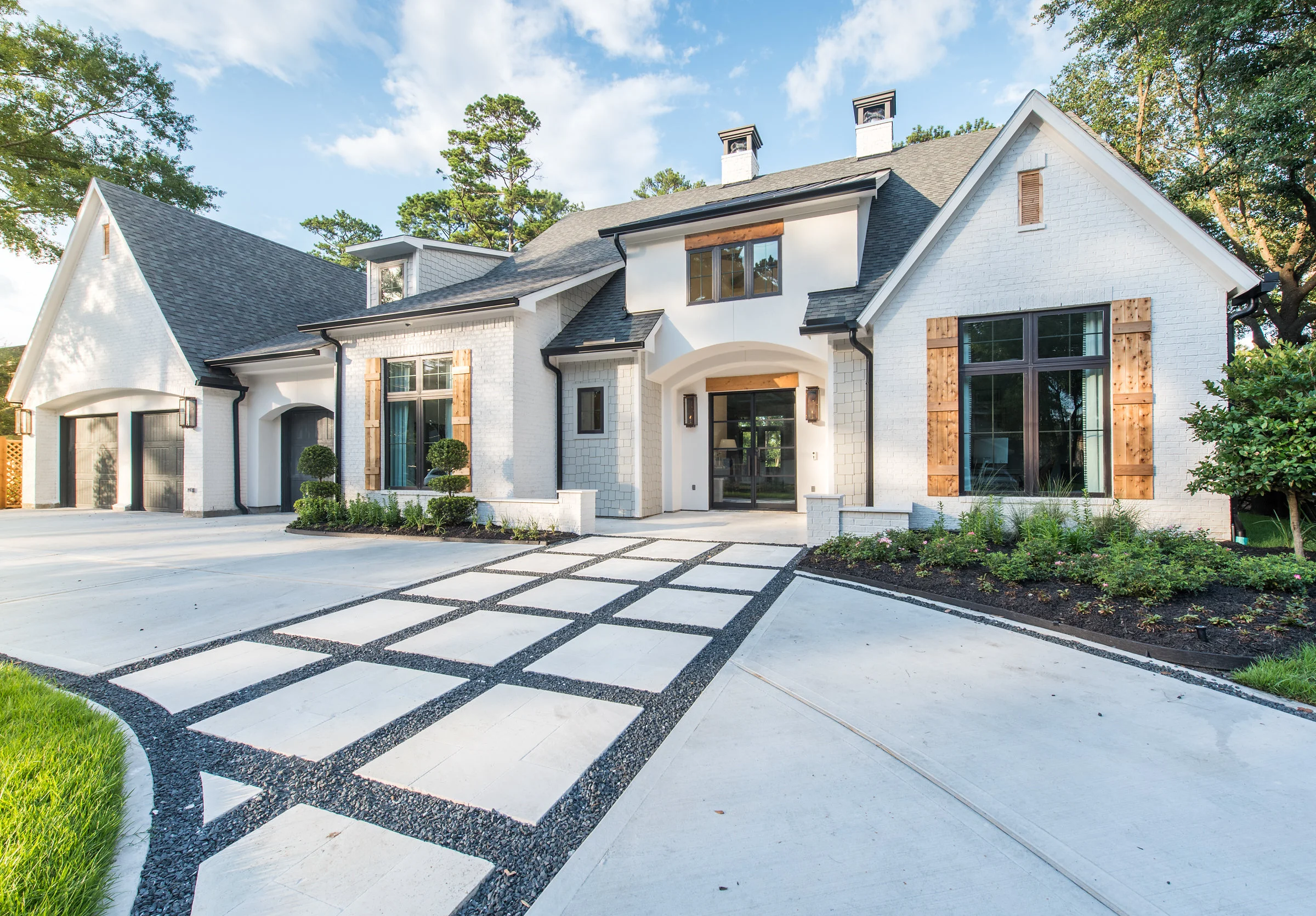
The homeowners and their 3 children actually lived in this neighborhood and played this golf course for many years. This hole on the golf course was always their favorite, so when they got the opportunity to purchase this lot, they jumped on it. This lot came with a very tired and out dated home that got demolished. The first time we visited the property, it was an empty lot. Today this home is a dream realized.
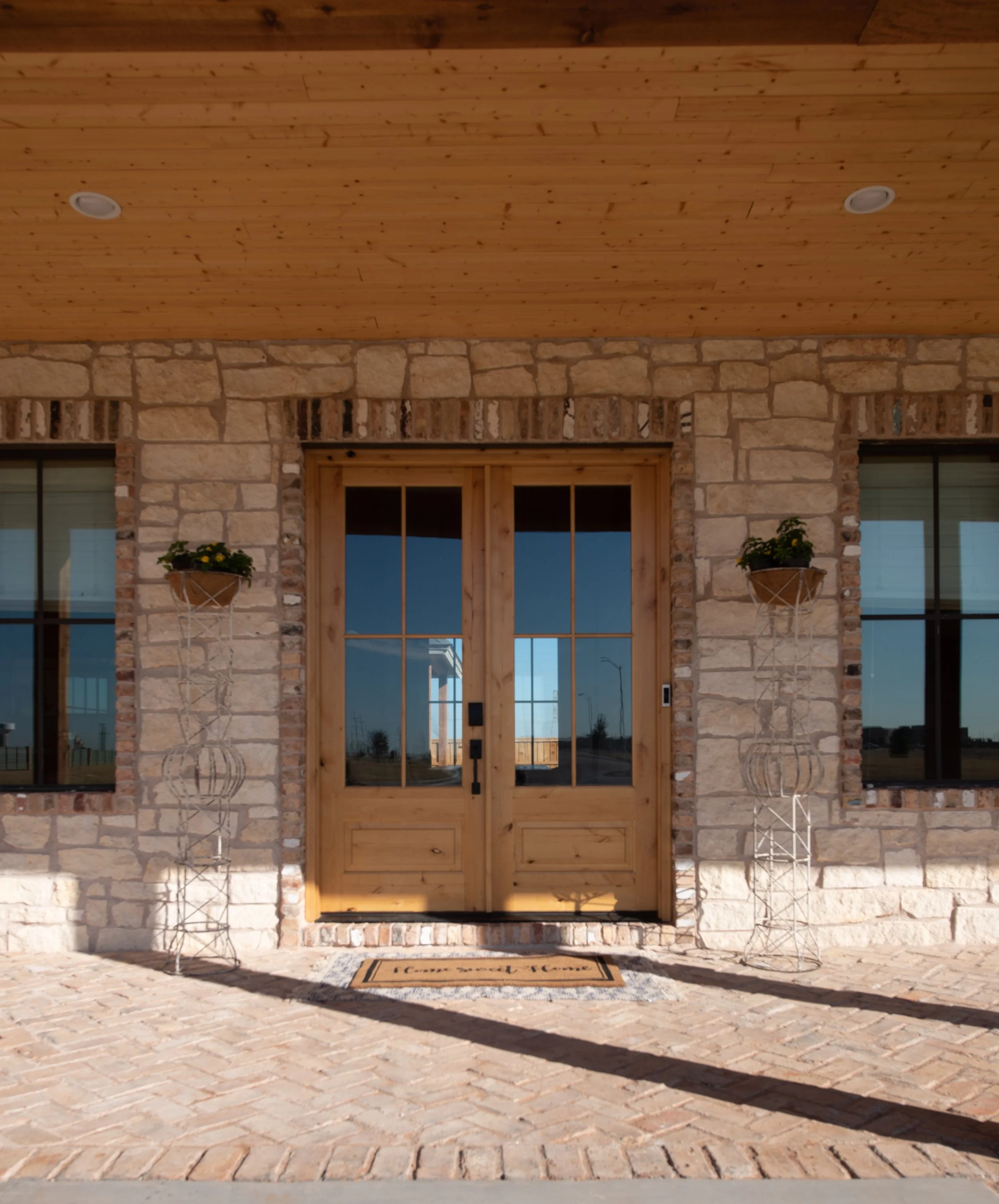
You’ll notice a nice mix of exterior materials… painted brick, stucco, and shake siding. You notice shingles and metal for the roofing. Bronze windows and front door provide a beautiful contrast to the white brick and stucco. The cedar accents and gas lanterns add so much warmth.


This back yard was really built around this incredible view. Beyond the pool, there’s a creek and beyond that the immaculate golf course. One gets the feeling that they are visiting a private resort rather than an individual’s home.
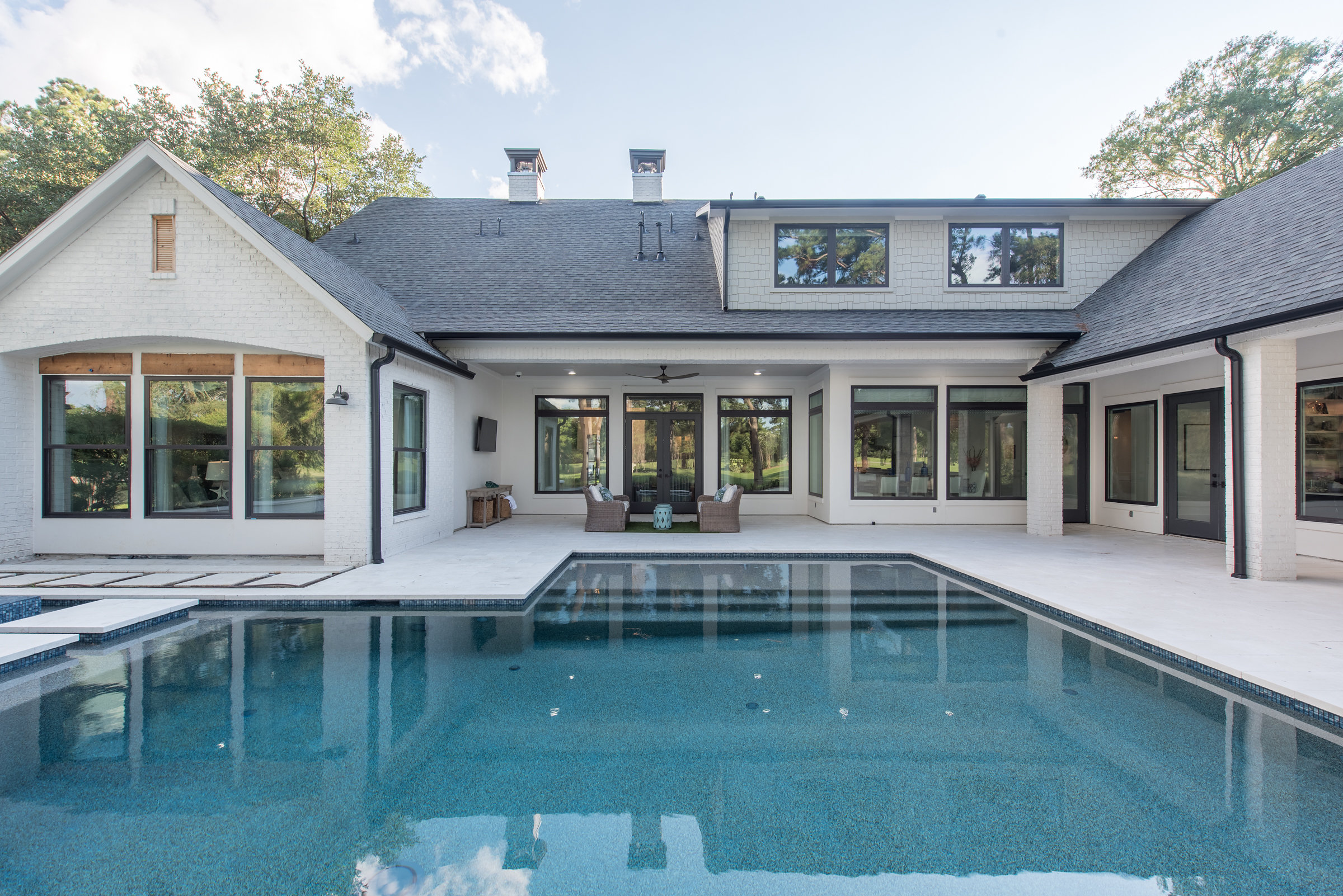
One element to the pool design that I really love were the steps going across the pool. Smelek Design was so clever to add these “lily pads”.

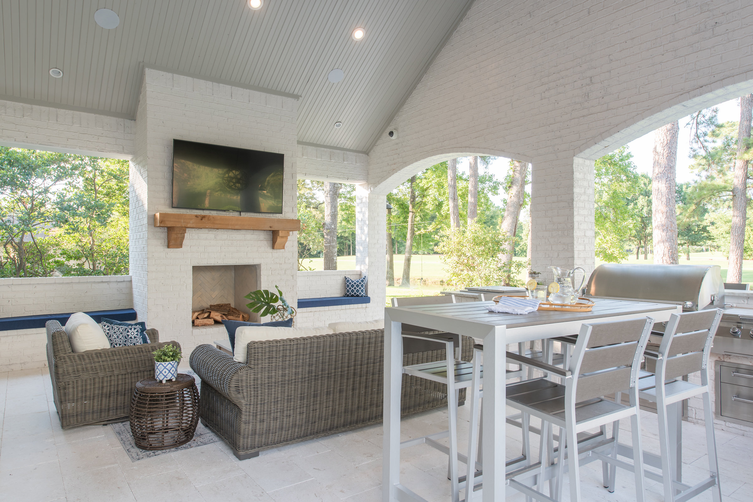
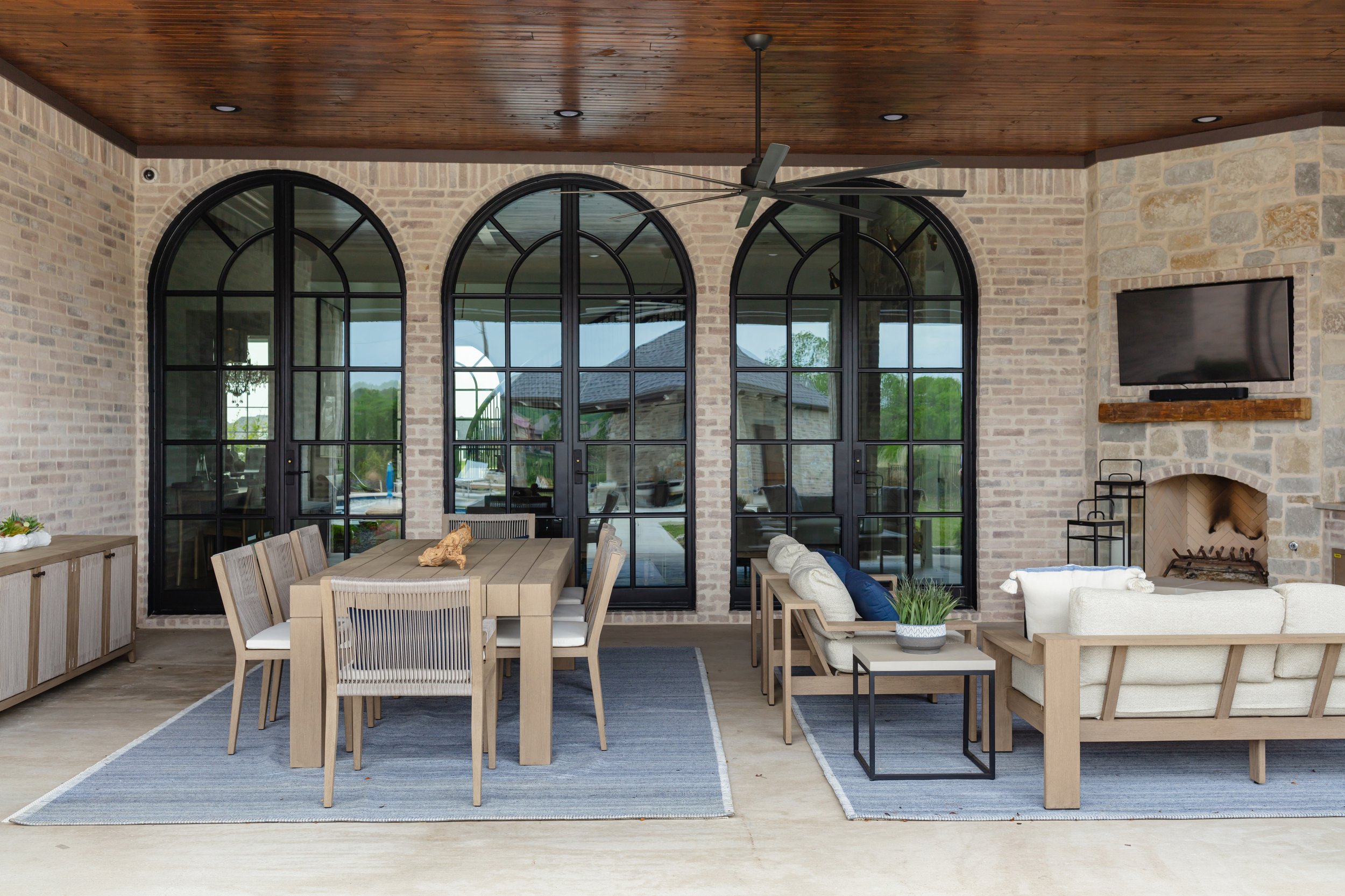
There’s plenty of room for entertaining and dining outside on this covered patio!


I hope you enjoyed our tour of the exterior! Leave us a note and let us know what you think! Please subscribe so you won’t miss out when we reveal the rest of this project!