I was contacted by a couple in Midland, TX who found Duckworth Interiors on social media and asked us to design their custom French Acadian home. I have to say how flattered I was that they knew they wanted to work with us because of previous Acadian homes we’d worked on! This young and fun family wanted to take a fresh approach to the French Acadian style and thus, “Hip Acadian” was coined.
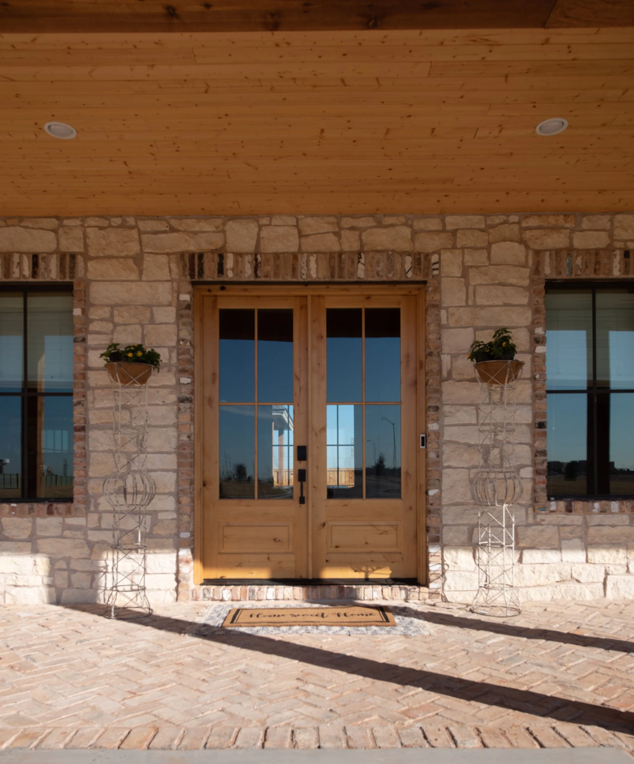
The exterior of the home is a more traditional pallet of Texas limestone, antique brick, and cedar.
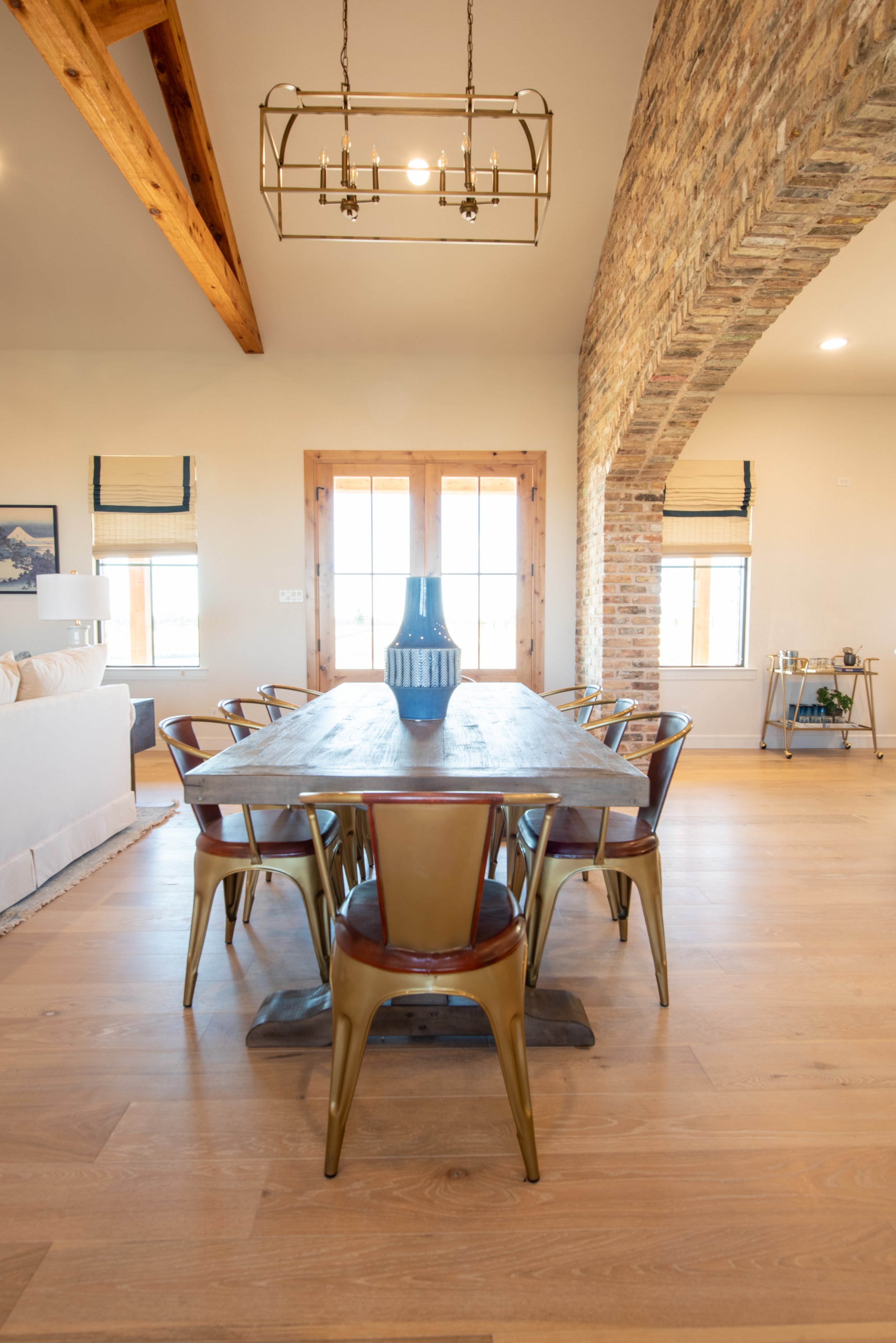
When you walk in the front door, you’re in the main living space with the dining room in the middle and the kitchen and family room on either side. You’ll notice we brought the antique brick inside with a chunky brick-clad arch way separating the kitchen from the rest of the space.
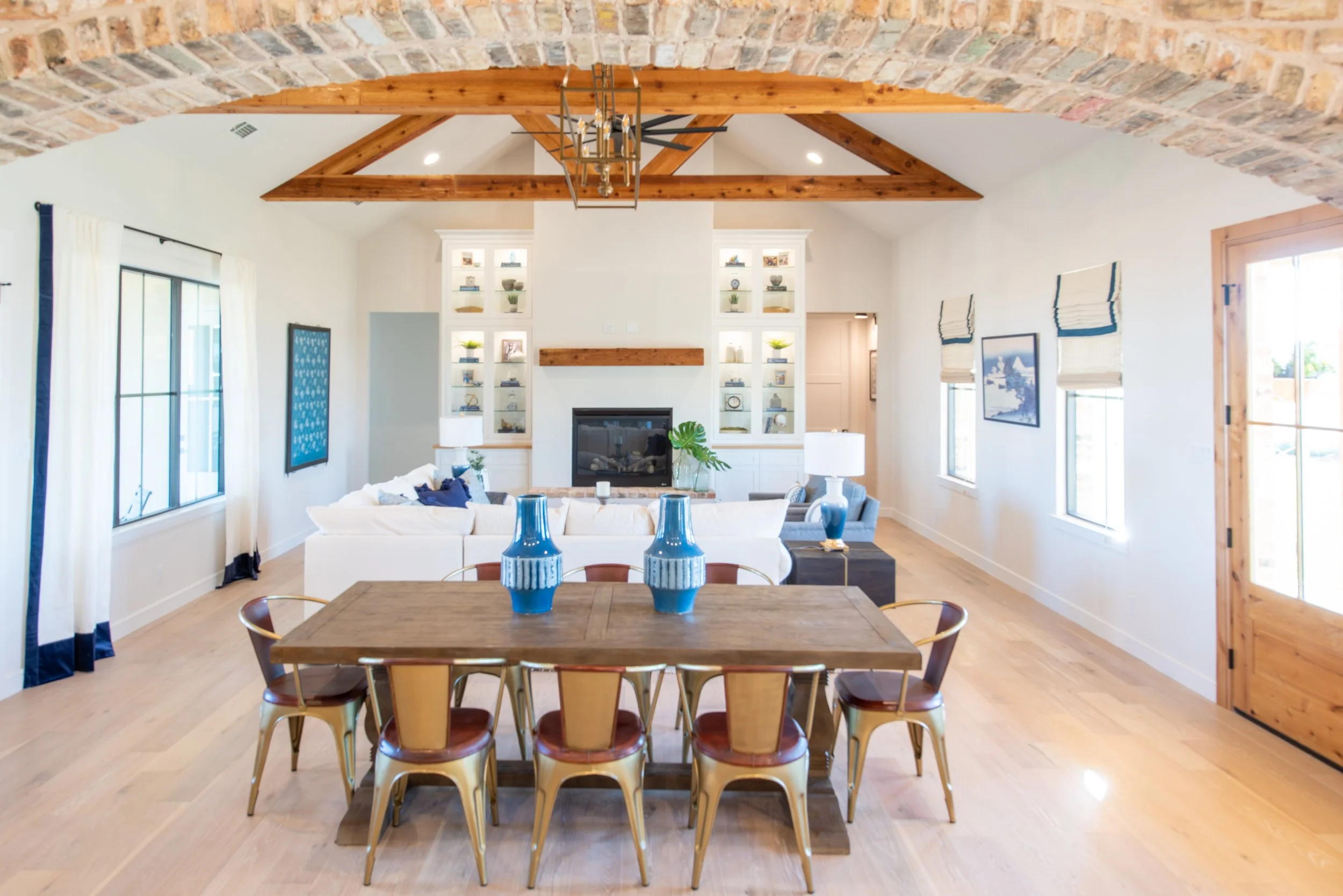
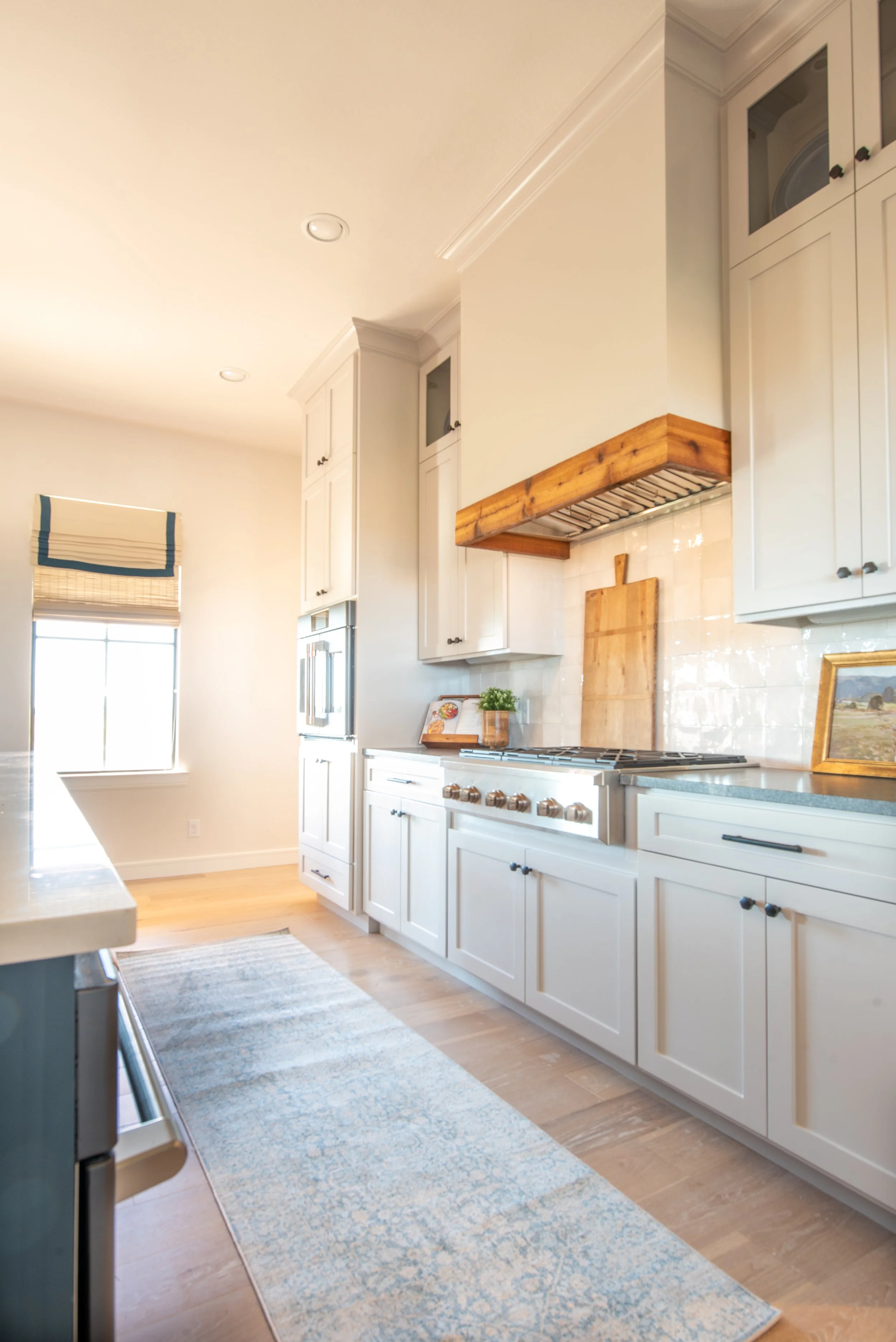
The antique brick was also used for the fireplace hearth seat. We decided to use cedar accents inside for the family room beams, fireplace mantle, and on the kitchen hood.

We filled the two 11 foot tall built-ins that flank the fireplace with blue books, family photos, accessories, and some greenery.

For the furnishings in the main living area, we used an overall neutral palette with varying hues of blue. For the brick arch way going into the kitchen, it was important to me that this appear to be an old exposed structural wall. To achieve that, it meant we needed to take the brick to the ceiling on both sides.

We chose to drop the kitchen ceiling to make it feel more cozy. We painted the perimeter cabinets white, slightly darker than the walls for just the tiny contrast. The perimeter countertops are black with a subtle white vein. The island we painted navy and used a quartzite countertop with lots beautiful linear movement.


Leather always pairs nicely with navy, so these barstools were a beautiful and durable choice.

We chose Cafe Appliances in the kitchen, which is a line that allows you to mix and match the appliance color and handle finish. I love using Cafe for this reason. Also, how adorable is this French door oven?!
A simple zellige tile with variations of cream and grey was used for the backsplash.

For the laundry room, we used the same paint color and countertop that we used on the kitchen perimeter. We laid the antique brick on the floor in a herringbone pattern.

My clients and I were antiquing one day, and we happened upon this “army green” military-style desk. We were all in love! We used 1x2 wood trim to created some interest and texture on the feature wall. To find our paint color for the feature wall, we ended up taking a desk drawer to be color matched at the paint store!

The credenza was a family piece that we reused. Above it are some prints I found while shopping for my clients in New York. The drapery is a mid-century pattern in earth tone colors.

We had some fun in this secondary bath using black and white hex tiles, a blue-grey cabinet and chrome fixtures and accessories.

Secondary bathtubs have come a long way over the years. These days, it’s easy to find tubs deep enough that an adult would actually enjoy bathing in!

In the guest bedroom we used a neutral palette with dark green nightstands, accent pillow, and antique suitcase.

Reading lights next to the bed with switches are great in guests bedrooms. They allow your guests to turn off the overhead lights and navigate their way to the bed easily in an unfamiliar room.

Some black and white prints of Texas landscapes by my husband and photographer, Grant Duckworth, give guests a taste of some local scenery. When I take prints to be framed, sometimes I like to “weight” the mat at the bottom, as seen here. This is a great solution when you need art to fill a space that’s larger than the print you have.

The game room is a fun and electric space! You can only be happy in this room! The lady of the house is a huge Beatles fan and requested a Beatles-themed room.

The design evolved around the two Beatles prints that we found for above the sectional. We pulled all of the colors out of the prints for everything else.

The homeowners also requested an antique record player cabinet. We found this one in a Dallas antique store that had been fully restored, including adding Bluetooth capabilities for our modern world. It was painted a fun lacquered turquoise! Above the cabinet is a Kate Roebuck print flanked by orange lamps.
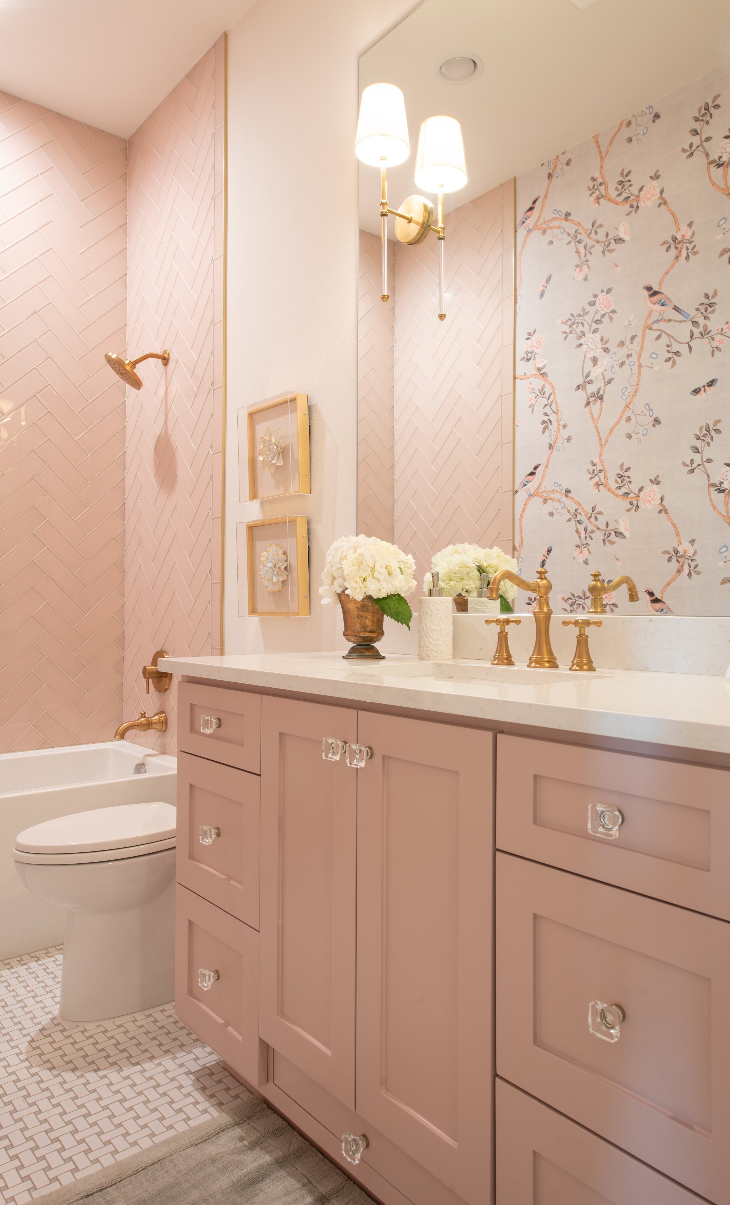
Up next: a bath for a princess! We were so delighted to design this adorable bathroom for our clients’ newborn baby girl. We used pink glass subway tile. Again, we used our color match trick to match the cabinet paint color to the tile. Gold fixtures and crystal knobs are the icing on the cake!

Check out her hidden stool! We love to design with functionality in mind. This platform was built into the cabinetry. Simply slide it out when needed and back in when finished.
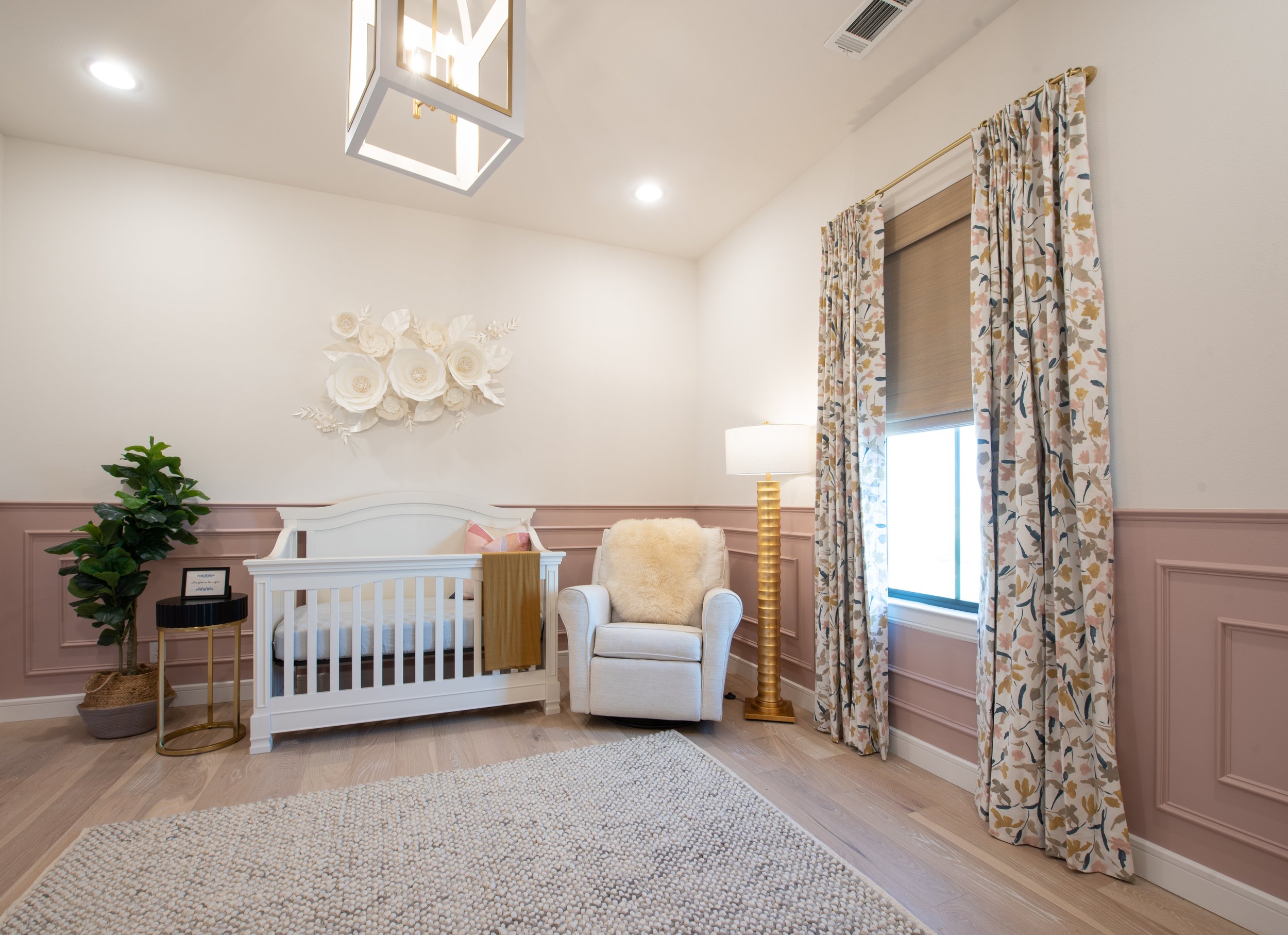
We continued the pink into her nursery with a paneled wainscoting. I’m always very careful about what I put on the walls above cribs. I’d never want anything to fall on a sleeping baby! That’s why these 3 dimensional paper flowers were a beautiful and safe art solution. A comfortable glider/recliner with dimmable lighting for nighttime feedings is a must (and so are blackout drapes)!

We added a fun and whimsical art piece above the changing table that will transition from art for a nursery to a child’s bedroom.

We had a lot of fun with color in the master bedroom! Again this room was designed around the art. The pieces above the bed are by a Spanish artist, Natalia Roman. We used a navy velvet bed, a mustard yellow settee, and a black marble table.

The drapes are a fun pattern and by artist Angela Chrusciaki Blehm.

A sliding door separates the master bedroom from the master bath room.

The showpieces of this bathroom is the grey clawfoot tub with crystal chandelier above. We matched the color of the cabinets to the tub and clad the whole bathroom in marble!

I hope you enjoyed this project reveal of the #hipacadian project! Be sure to click here to see our feature in the Ellis County Living Magazine. Drop a comment and let us know what you think!
